35 Blue Christmas Table Setting Ideas for an Elegant Holiday
Disclosure: As an Amazon Associate I earn from qualifying purchases. This post may contain affiliate links, which means I may earn a small commission if you click through and make a purchase – at no extra cost to you.
A blue Christmas table setting instantly transforms any holiday gathering into something elegant, calm, and quietly luxurious. While traditional reds and greens feel nostalgic, blue brings a refreshing, modern twist – soft, serene, and endlessly versatile.
In this post, you’ll find 35 blue Christmas table setting ideas that blend timeless design with cozy sophistication. From shimmering glass ornaments and velvet napkins to brass candlelight and icy tones, every detail adds depth and atmosphere. Whether your style leans classic, coastal, or modern minimal, these ideas help you create a winter table that feels warm, balanced, and beautifully unique. A place where every guest will want to linger just a little longer.
Quick Blueprint: The 5-Element Blue Tablescape
A simple formula I use over and over:
- Base – white/linen tablecloth or a natural wood top.
- Color Story – one hero blue (navy, powder, slate) + one neutral (white/cream) + one metallic (silver or champagne).
- Height – max three candle heights and a low centerpiece (< 12 in / 30 cm) so guests can talk across the table.
- Texture – mix linen + ceramic + glass; add one soft element (velvet ribbon/napkin).
- Edit – remove one item before you’re done. Breathing room = luxury.
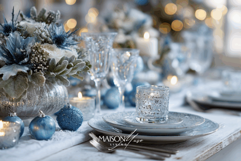
1 | Soft Winter Elegance with Icy Blue Glassware
The magic of a blue Christmas table starts with light: cool tones that shimmer against crisp white linen. Choose icy blue glassware and pair it with transparent plates or frosted chargers to let every reflection glow softly under candlelight. Add a few sprigs of eucalyptus or cedar to tie in the season’s freshness without overwhelming the look.
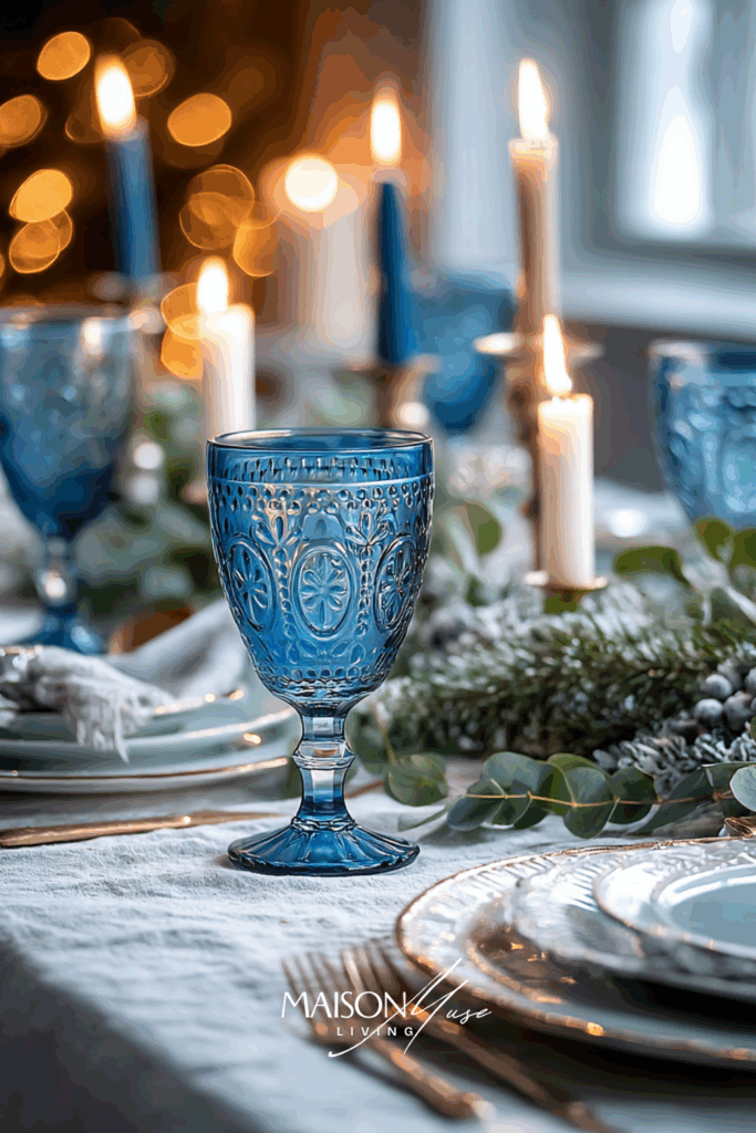
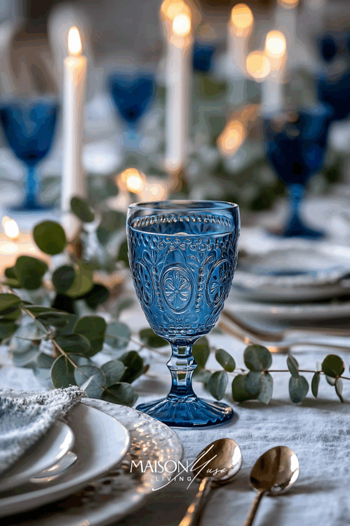
Why it works: Pale blue glass catches candlelight without feeling flashy. Keep the palette icy-blue, white, and a touch of silver.
2 | Navy and Gold Sophistication
For those who love contrast and depth, navy and gold create a luxurious combination that feels both festive and modern. Drape a navy linen runner down the center and accent it with gold candleholders and sleek tableware. This pairing instantly adds richness and drama, ideal for evening gatherings.
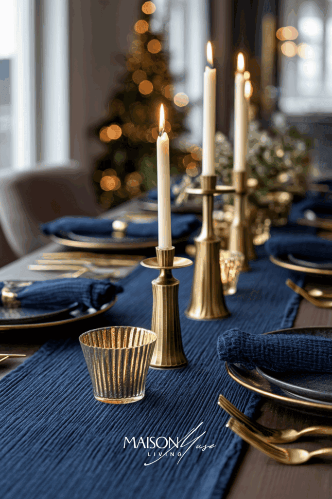
Why it works: Deep navy grounds the table; warm brass adds glow and luxe.
3 | Frosted Pine and Blue Velvet Touches
There’s something enchanting about mixing soft velvet textures with natural elements. Try layering blue velvet napkins over a white plate and slipping in a small pine branch or cinnamon stick for a subtle nod to the holidays. The contrast between velvet and greenery feels lush yet approachable.
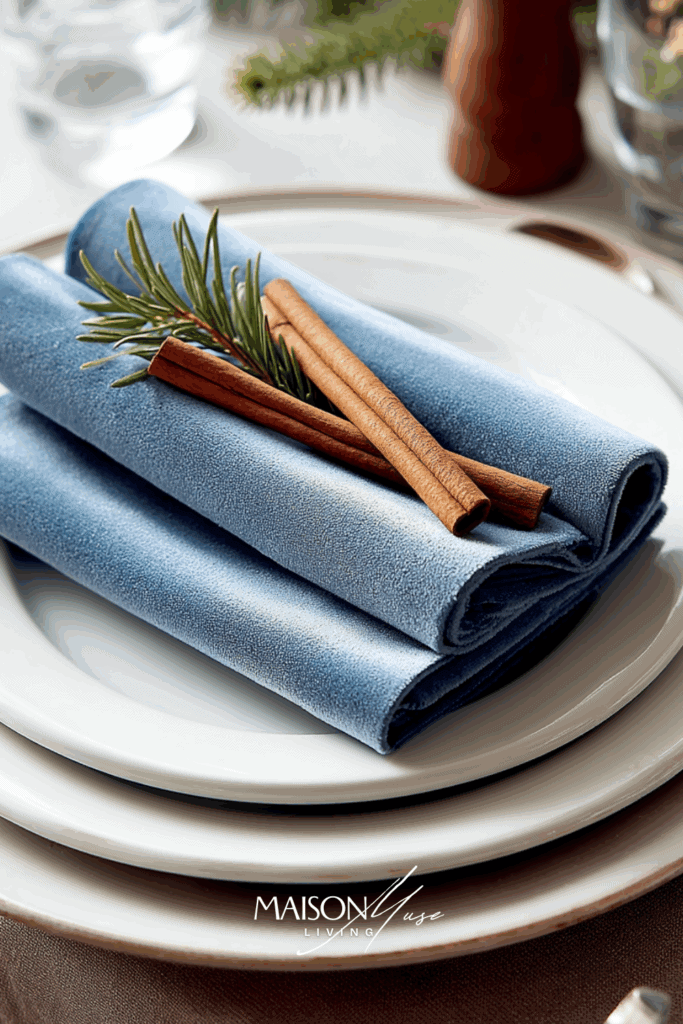
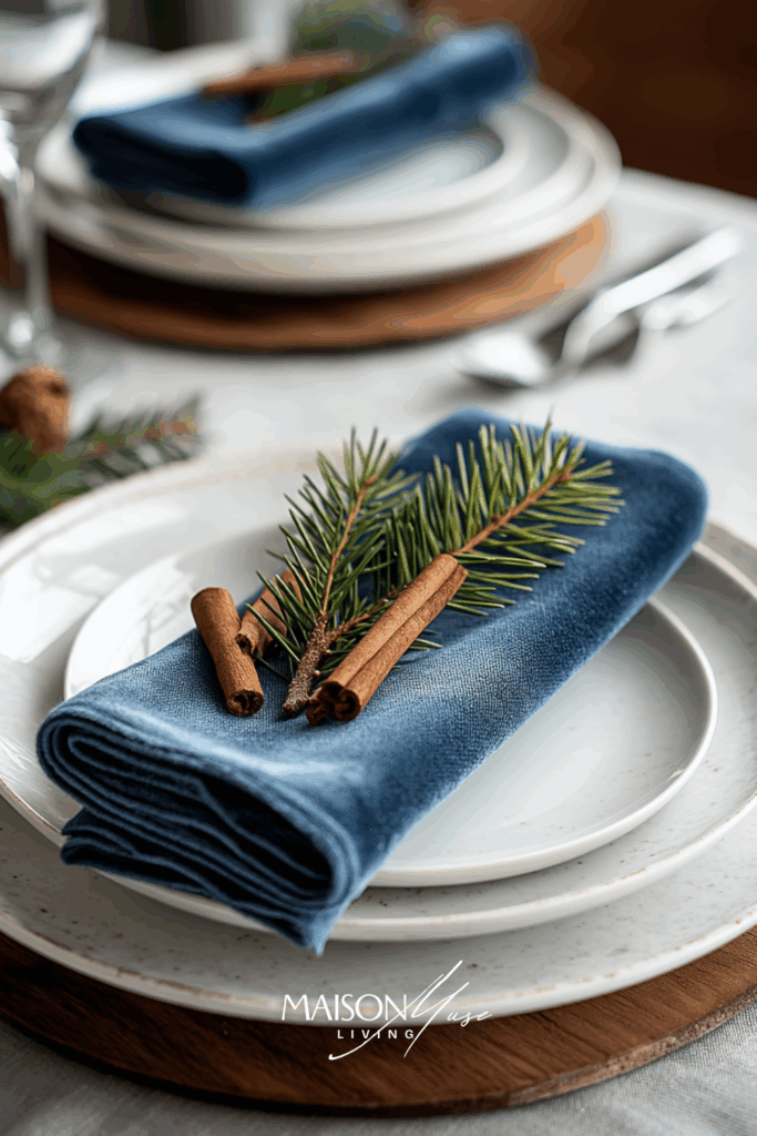
Why it works: Velvet brings depth and holiday richness; a single pine sprig keeps it seasonal, not fussy.
4 | Scandinavian Simplicity in Winter Blues
Clean lines, natural textures, and calm tones define this Scandinavian-inspired Christmas look. Combine light wood chargers, blue linen napkins, and frosted glass accents for a space that feels open and serene. It’s an understated, elegant approach that’s perfect for minimalist homes.

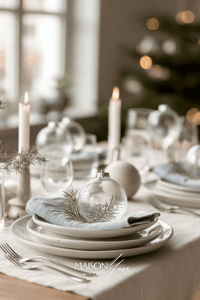
Why it works: Light wood + soft linen + clear glass = calm, airy, modern Nordic.
5 | Crystal and Silver Glow
If you love sparkle but want to keep things sophisticated, crystal and silver are your best friends. Use cut-crystal candle holders or etched glass vases filled with white roses or frosted pinecones. The reflection of candlelight on the silverware creates a soft, magical luminosity.
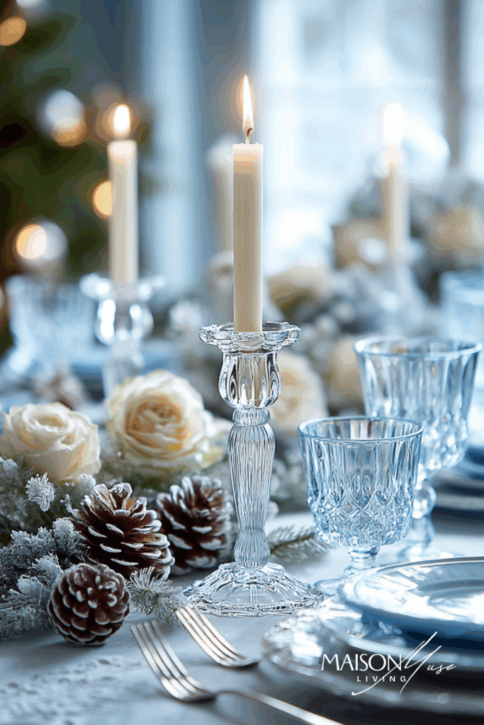
Why it works: Crystal reflects candlelight beautifully; pair with silver flatware for a cool, elegant sparkle.
6 | Coastal Blue Christmas Charm
Bring a coastal twist to your Christmas table with airy whites, soft ocean blues, and hints of sea glass tones. The mix feels refreshing yet festive, perfect for anyone who loves calm, seaside elegance even in winter.

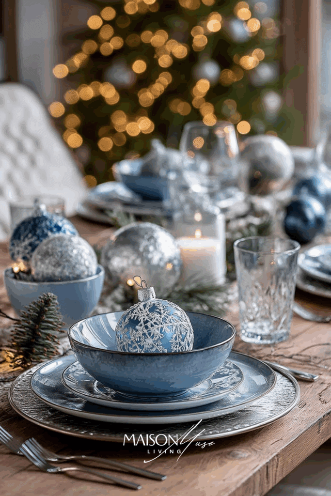
Why it works: The light palette and soft sea-glass blues instantly make the table feel fresh and airy, it’s Christmas reimagined for the modern coastal home. Blue keeps it elegant, while white and silver prevent it from feeling heavy.
7 | Dusty Blue and Silver Layering
Layering dusty blue napkins with silver chargers instantly adds depth and soft sophistication. It’s that kind of subtle luxury that feels effortless but refined.

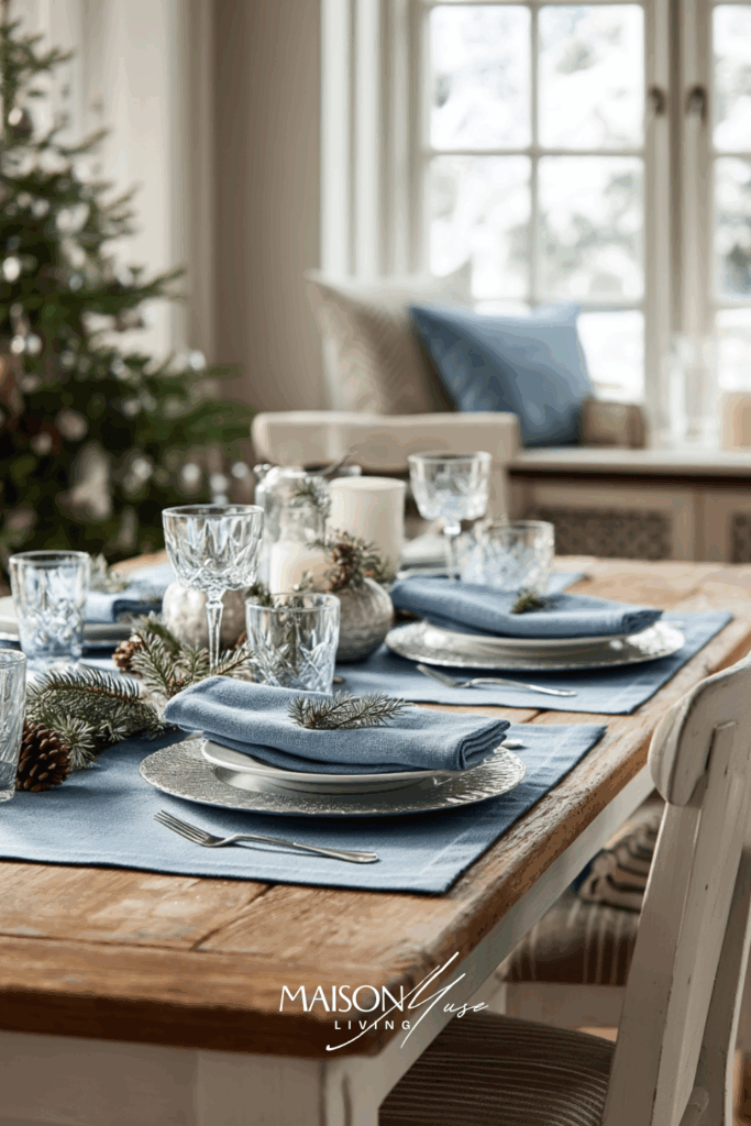
Why it works:
Soft dusty blue feels timeless, while metallic silver adds a festive glow. Together they balance warmth and cool tones beautifully, giving your table understated elegance without going overboard.
8 | Modern Ice Blue Simplicity
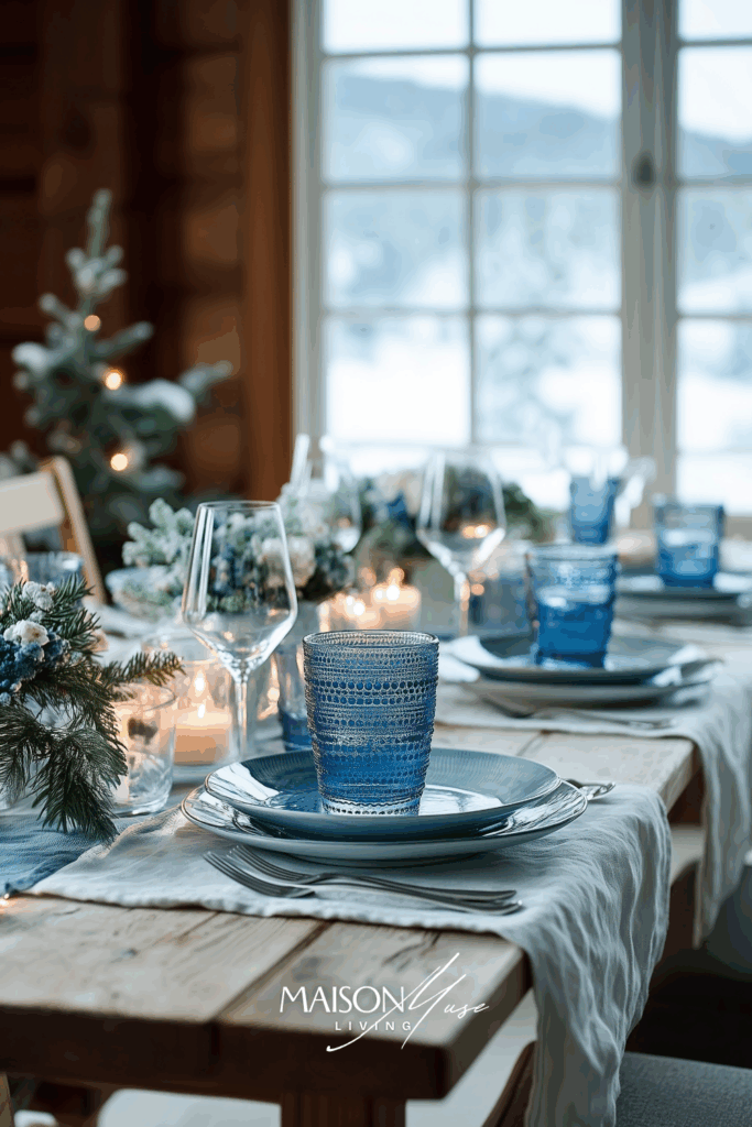
There’s a quiet kind of luxury in restraint. When you keep the palette to icy blues, crisp whites, and glass, the table feels light, intentional, and restful, like a bright winter morning. Start with a white table (or cloth), layer pale blue dinner plates, and keep the centerpiece low: slim glass candleholders with white or soft blue tapers and a wisp of frosted eucalyptus. The result is elegant without trying too hard.
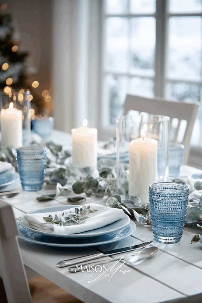
Why it works:
The pale blue reflects daylight and keeps the scene cool and airy; glass and white add clarity so the table reads elegant, not busy. Minimal height keeps sightlines open and conversations easy.
9 | Frosted Clay & Blue Harmony
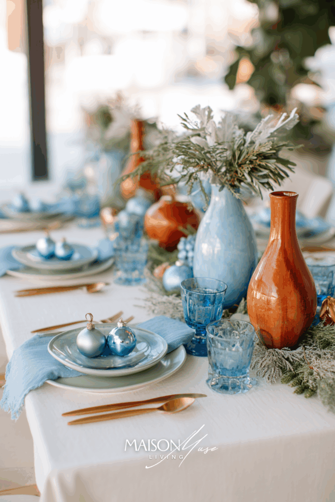
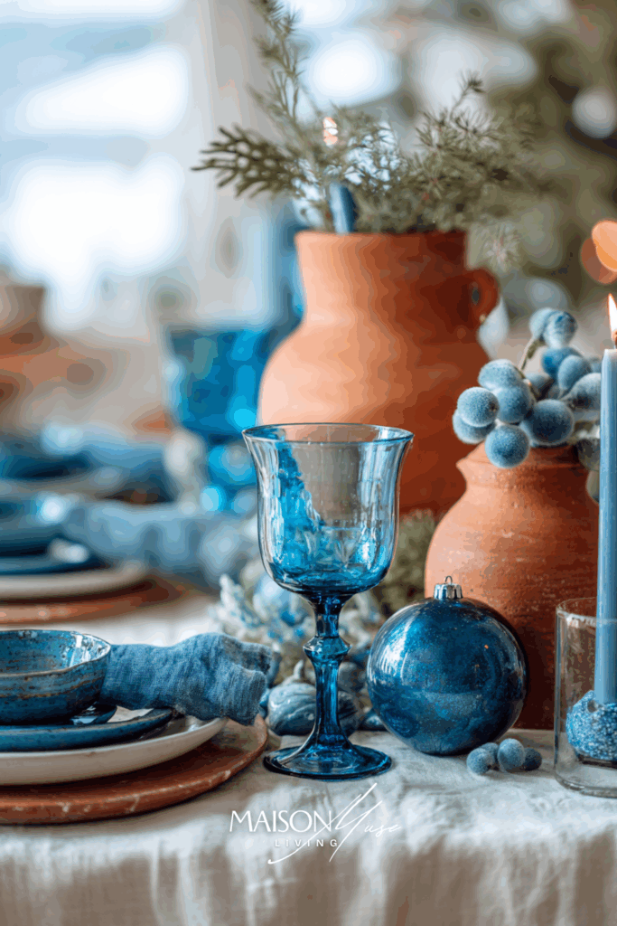
Here’s where the palette gets interesting: think of ice blue meeting sun-baked adobe under winter light. It’s unexpected, sophisticated, and feels like the new era of holiday styling: part European minimalism, part California warmth. The key is keeping the base soft: pale linen, diffused daylight and layering those muted tones that whisper winter instead of shouting it.
Start with a whitewashed or pale sand tablecloth. Use clay-toned plates or terracotta chargers to ground the look. Then layer in soft blue glassware or frosted candleholders for that cool, crisp touch. Add a few sprigs of olive, dried lunaria, or pine, and let the materials (linen, ceramic, glass) do the talking. Finish with a scattering of matte ornaments in champagne or smoke, just enough to catch the light.
Why it works:
Pairing cool blue with earthy warmth gives the table depth and personality. The contrast highlights each tone, while amber glass and terracotta add cozy, candlelit energy.
10 | Ice Blue & Champagne Gold Elegance
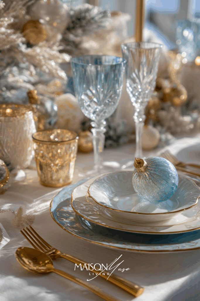
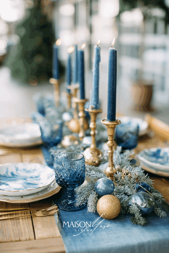
This is the kind of table that feels like snow falling under candlelight: soft, glowing, quietly luxurious. Ice blue plays against champagne tones for that editorial, high-end Christmas aesthetic. It’s sophisticated, not loud; more Elle Decor than department store display.
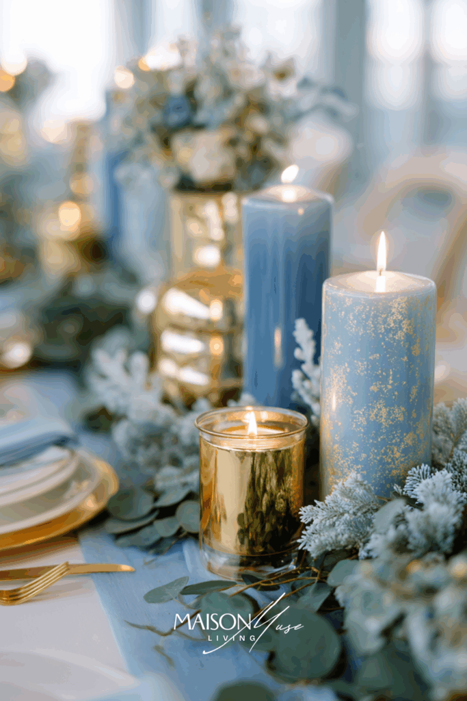
Why it works:
Blue and champagne create a sense of modern opulence: light reflects beautifully across metallic textures, while frosted greenery keeps it seasonal. The gold tones warm the cool palette, giving balance and a soft glow that reads instantly as “holiday.”
11 | Midnight Blue & Velvet Green Luxe
Think moody, cinematic, and deeply festive. A dark wood table, lush green velvet, and deep navy blues accented with candlelight. It’s the type of color story that feels like an intimate dinner in a mountain lodge: stylish, but rich and dramatic.
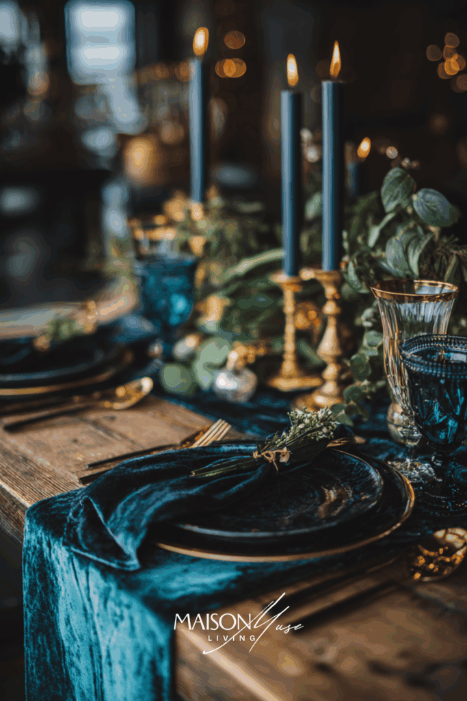
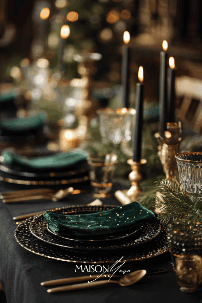
Why it works:
The rich interplay of blue and green adds depth and sophistication. The darker palette enhances candlelight reflections, making every surface glow subtly, perfect for an evening Christmas dinner.
12 | Powder Blue & Soft Neutrals Serenity
For a lighter, Scandinavian-inspired approach: powder blue mixed with beige, white, and a touch of dried natural decor. It’s calming, airy, and incredibly photogenic. The perfect look for those who love minimalist but still want Christmas to feel special.
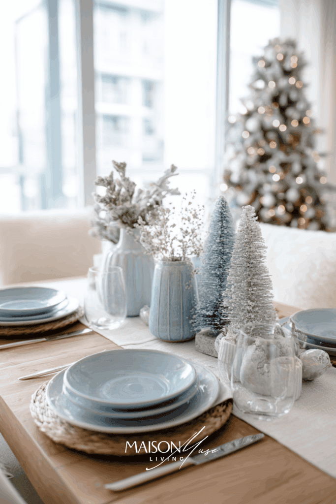
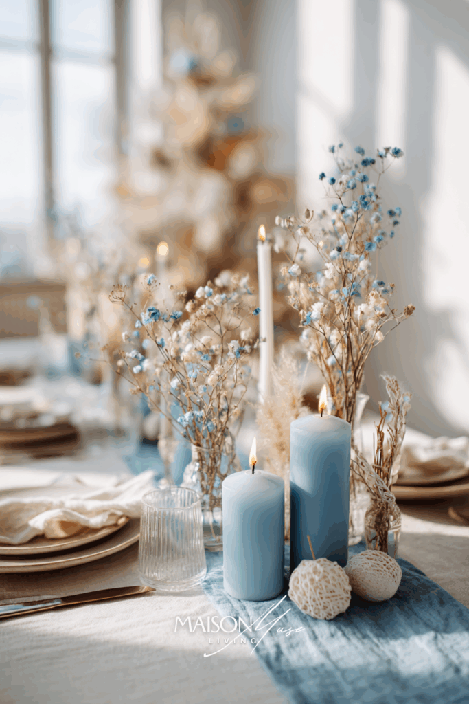
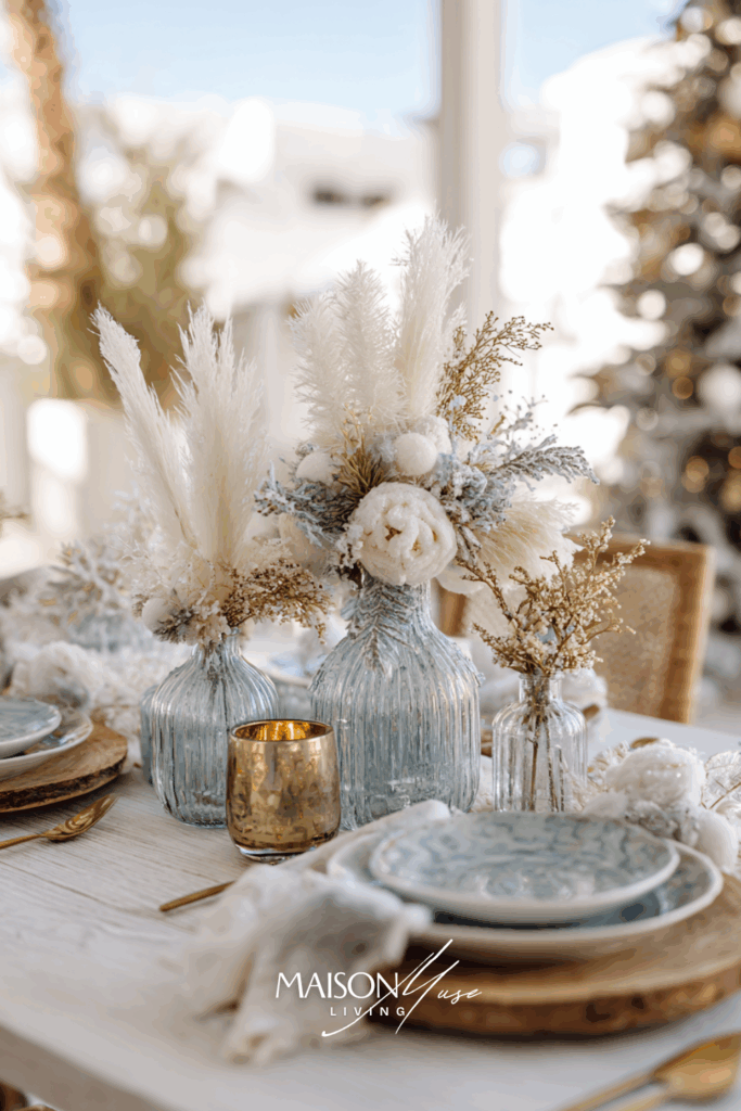
Why it works:
This palette feels like fresh snow and warm linen – understated yet soulful. The soft blues bring calm, while the organic materials (linen, wood, dried florals) add natural warmth and texture. It’s modern simplicity at its most timeless.
13 | Blue & Blush Modern Romance
Blue doesn’t have to be cold. When paired with soft blush pink and warm candlelight, it becomes unexpectedly tender and editorial. This palette feels high-end and personal, like a boutique Christmas dinner at home.
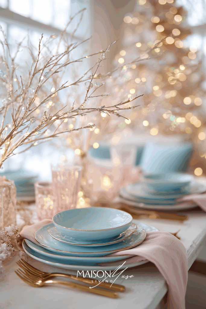
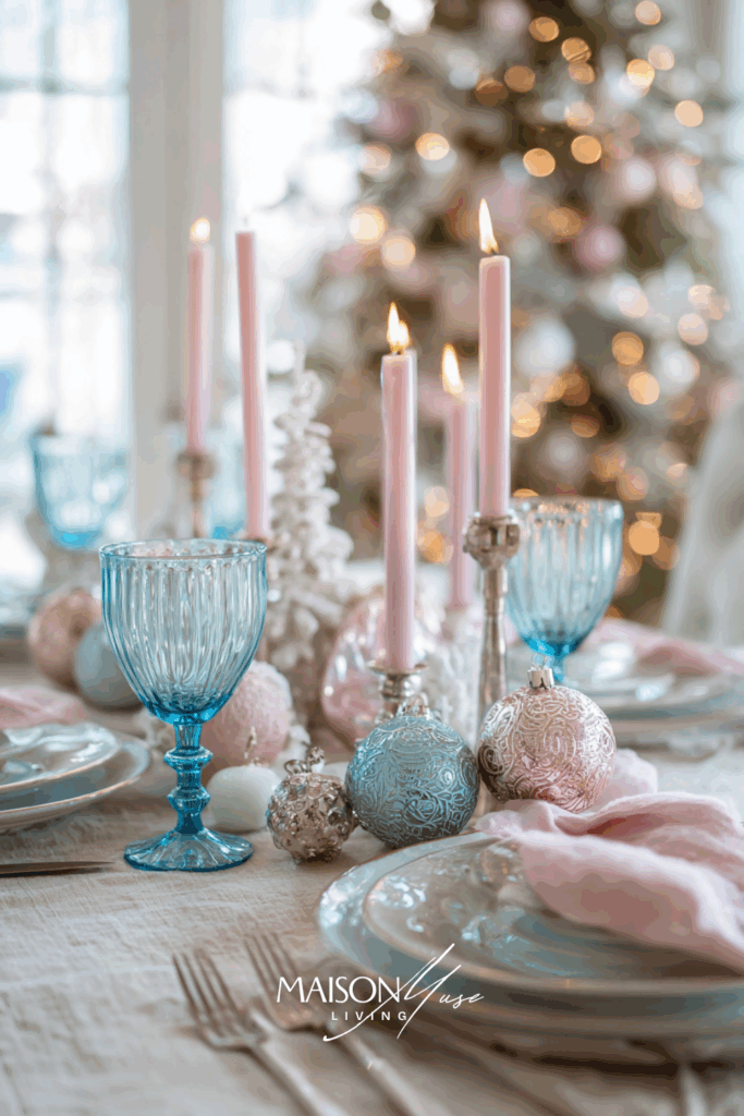

Why it works:
This mix softens the blue into something emotional and welcoming. The blush tones add warmth without stealing the spotlight, and the out-of-focus Christmas tree gives that subtle “holiday sparkle” that instantly sets the mood.
14 | Blue & Copper Glow
This one’s pure visual magic: the depth of blue paired with metallic copper feels luxurious and bold. It’s modern Christmas styling for someone who loves sophistication with a bit of glow.
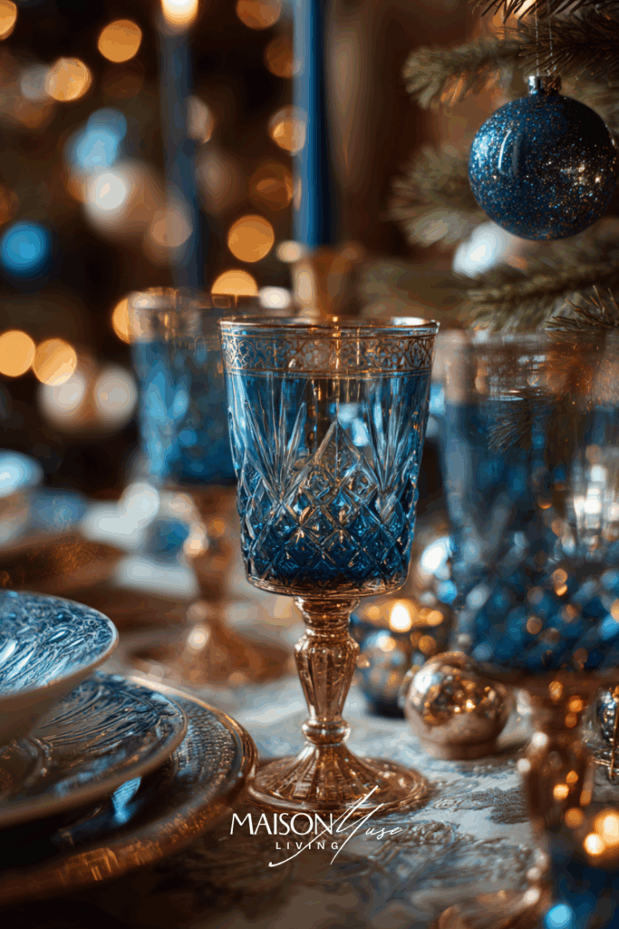
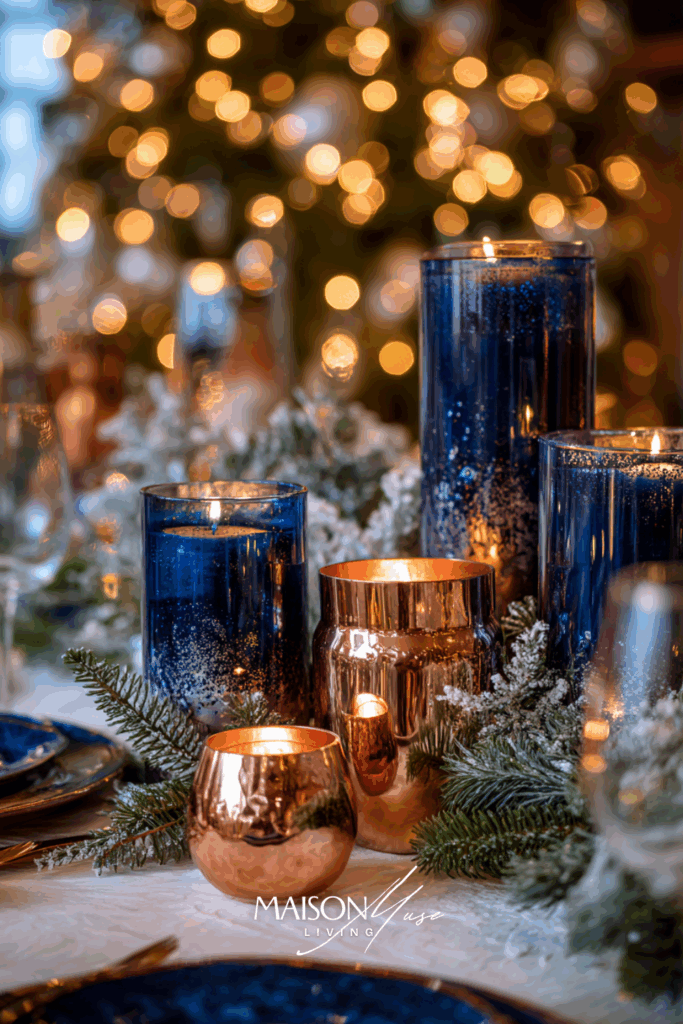
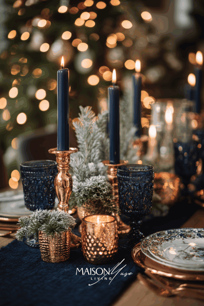
Why it works:
Copper balances blue with richness and firelight – the perfect contrast for winter scenes. The overall feeling is luxe but comfortable, creating visual warmth that makes even deep tones feel intimate and festive.
15 | Arctic Blue & Natural Greenery
This section celebrates what happens when cool blue meets fresh greenery. A modern Nordic feel that’s grounded in nature. It’s crisp, fresh, and timeless.
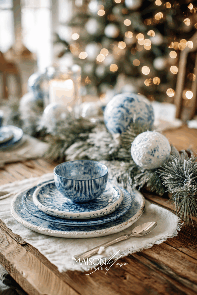

Why it works:
Blue and green echo nature – frost and fir – without feeling overdone. The Christmas tree in the distance anchors the scene in the season, while the light blues keep it clean and airy. It’s festive minimalism done right.
16 | Blue & Burnt Orange Glow
There’s something irresistibly rich about the meeting of warm firelight tones and cool blue. This palette captures that perfect Christmas evening energy: glowing candles, frosted ornaments, and a touch of deep orange warmth that makes the blue sing.
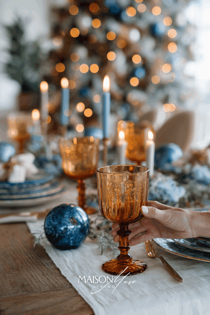
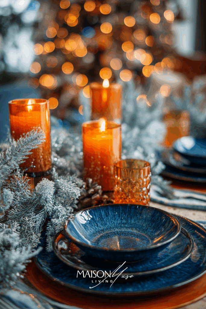
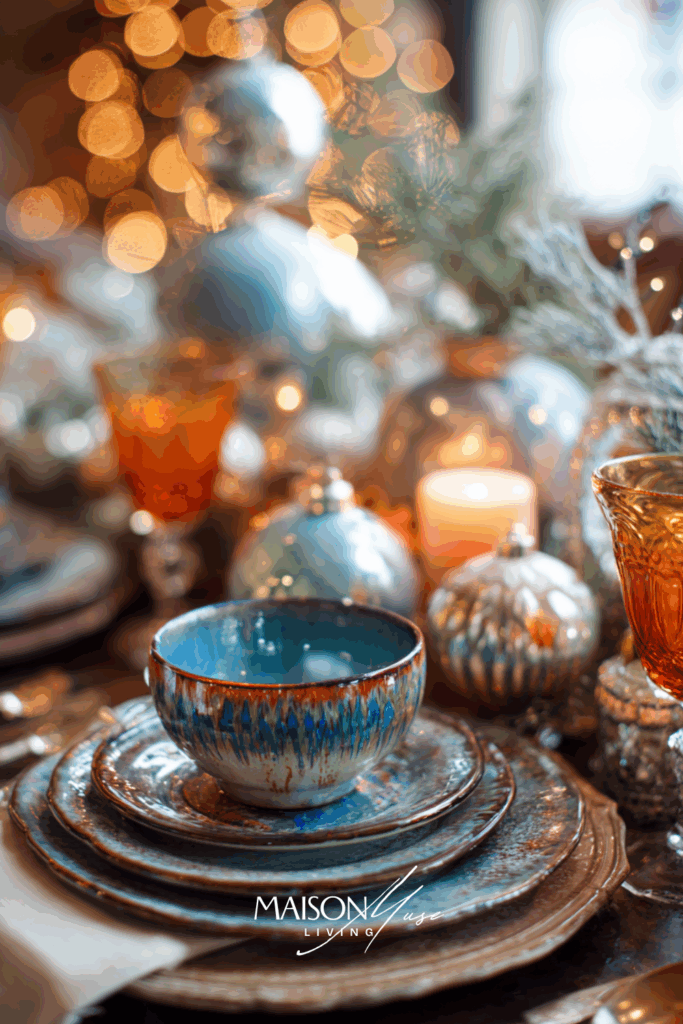
Why it works:
This combination feels like winter meeting the hearth. The burnt orange tones add depth and warmth to the cool blues, creating visual tension and comfort at once. The effect is chic, editorial, and glowing, a perfect modern update to traditional holiday palettes.
17 | Blue & Sand Beige Nordic Calm
This palette whispers Christmas, rather than shouting it. Blue and sand beige create a naturally calming, Scandinavian-inspired look: minimal, but full of tactile warmth and texture. Perfect for lovers of quiet elegance.


Why it works:
The magic here is in restraint. Blue and beige bring a feeling of peace: airy, timeless, and photogenic. With frosted pinecones and simple white candles, the look feels festive but never forced, perfect for those who love Christmas with a whisper of sophistication.
18 | Blue & Forest Green Winter Story
For those who want Christmas to feel lush and grounded – this pairing of rich blue and deep forest green is full of depth, elegance, and contrast. It feels cinematic, like the quiet moments before a winter feast.
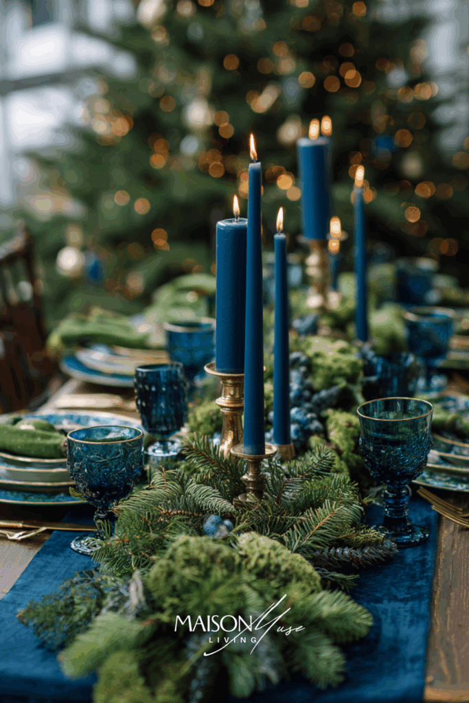
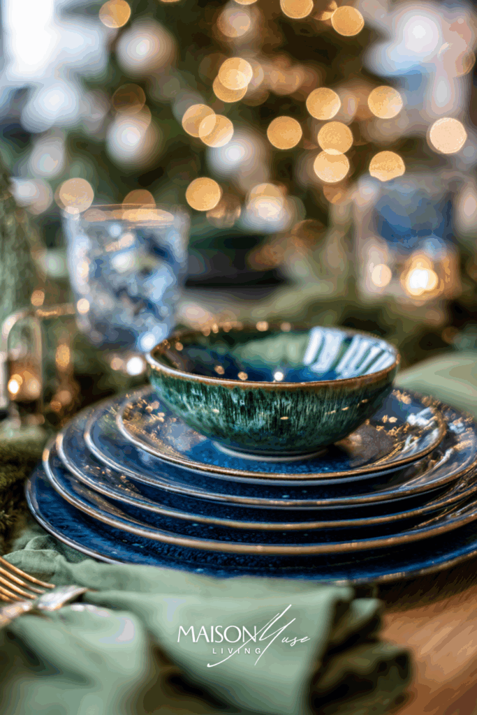
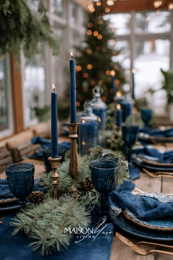
Why it works:
Blue and green together evoke nature at its most elegant: like snow-dusted pines under a twilight sky. The tones feel rich yet calming, while candlelight adds life and movement. It’s sophisticated Christmas storytelling for people who live beautifully but simply.
19 | Blue & Plum Berry Elegance
A moody, cinematic twist on the classic blue holiday table. The combination of deep blue with rich plum feels like winter dusk: luxurious, mysterious, and romantic. Candlelight bounces beautifully off the darker tones, creating a look that’s both dramatic and sophisticated.
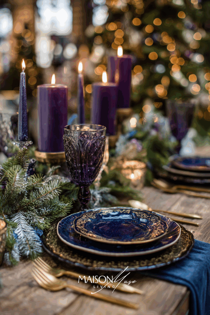
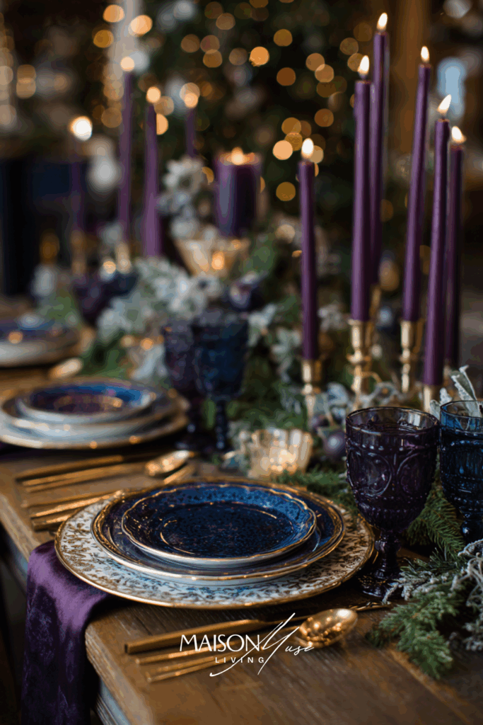
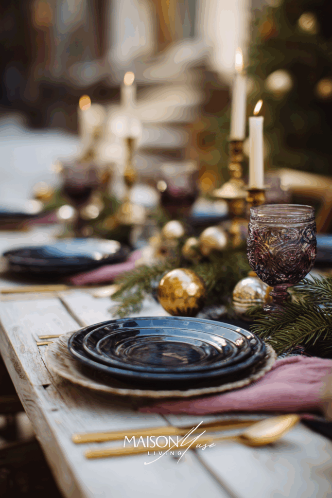
Why it works:
Plum and blue create a rich tonal balance that feels modern and regal. It’s unexpected but completely elegant, perfect for evening celebrations.
20 | Blue & Sage Green Whisper
This palette brings serenity to the holidays. Sage and blue are both cool, calming tones – when layered together, they create a soft, organic Christmas story that feels fresh and timeless. Think winter forest light filtering through frosted glass.
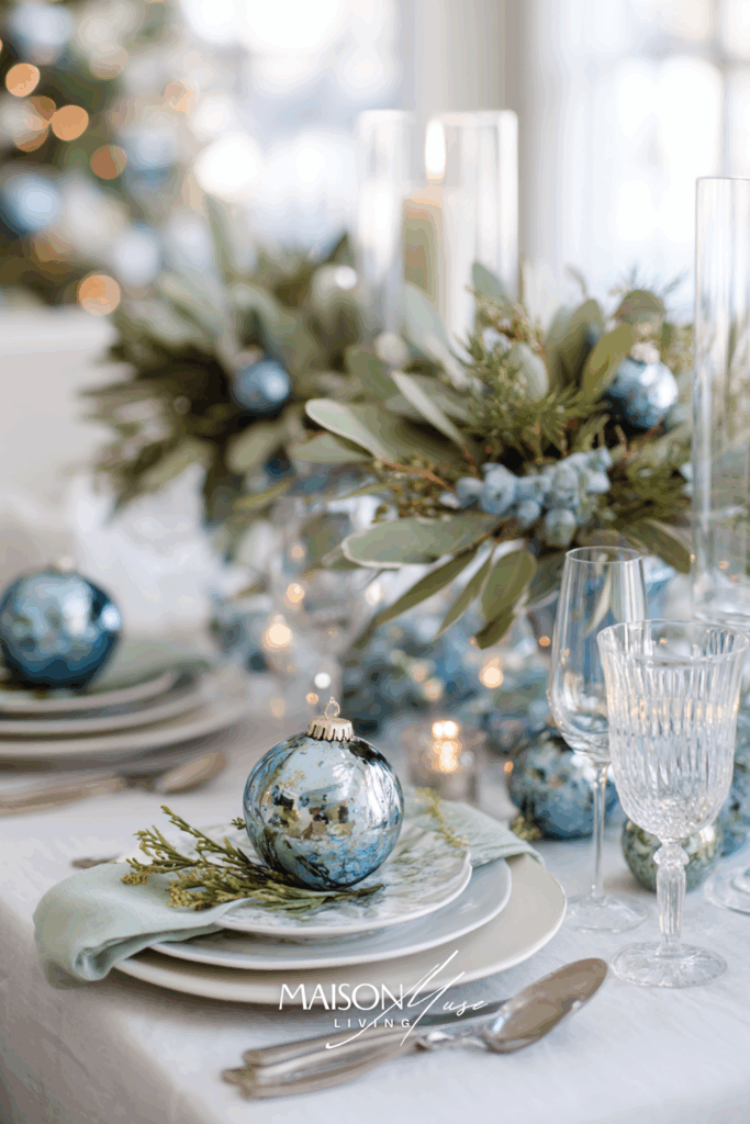
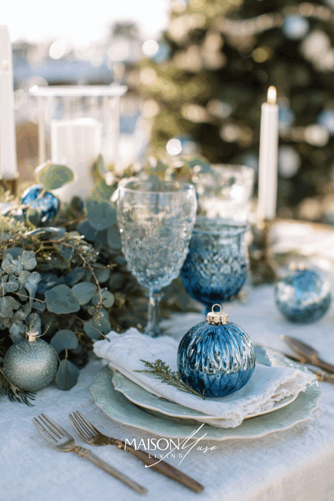
Why it works:
Sage adds nature’s calm to blue’s elegance. The palette feels grounded but still fresh, offering a sophisticated alternative to classic red-and-green. It’s the perfect combination for a Christmas table that feels light, modern, and connected to the season.
21 | Blue & Soft Peach Glow
A fresh, editorial twist for the design lover’s Christmas. Soft peach tones add warmth and femininity to powder blue, while gold or champagne details give it a polished, luminous finish. Perfect for daylight styling with candles, frosted accents, and a glowing tree in the background.
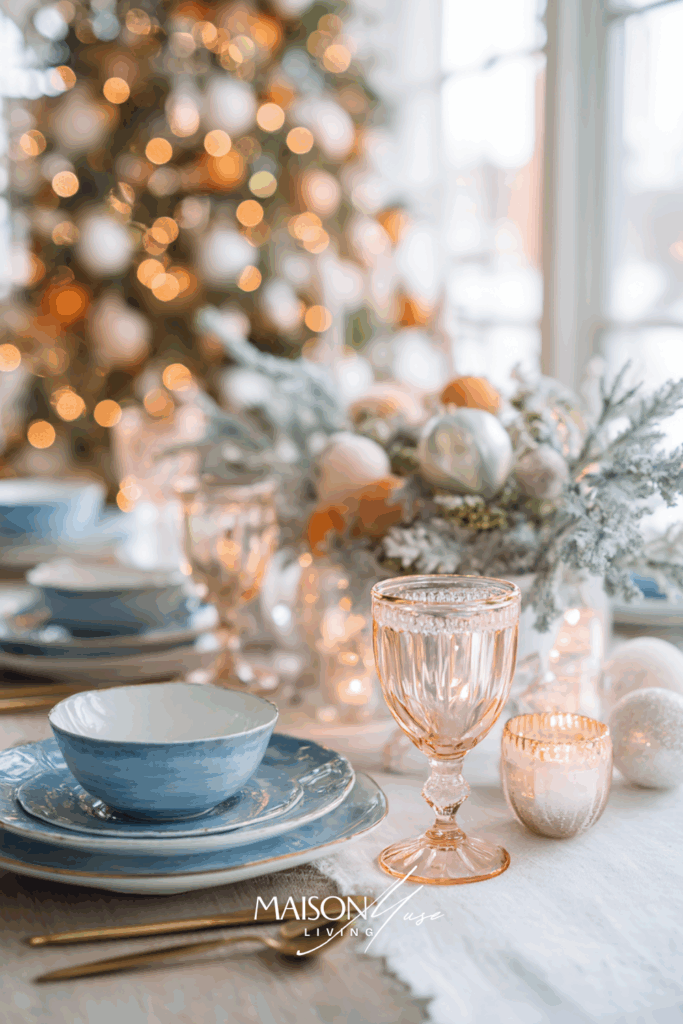

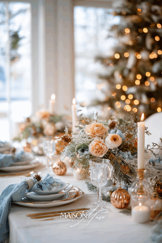
Why it works:
Peach and blue bring gentle contrast: warm and cool in perfect harmony. It feels contemporary, cheerful, and glowing without being loud. The palette brings a sense of joy and elegance to the season.
22 | Blue & Lavender Frost
There’s something ethereal about blue and lavender together: they feel like frost and moonlight sharing a secret. This palette captures a dreamy, enchanted take on Christmas. It’s cool, elegant, and a little unexpected – perfect for those who love soft, whimsical styling with modern charm.
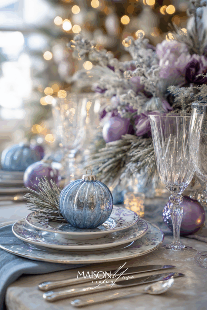
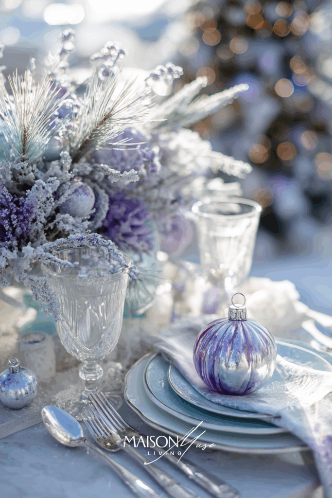
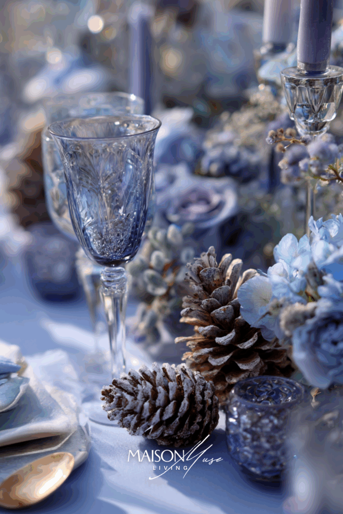
Why it works:
This combination feels like a fairytale brought to life. The lavender undertone adds just enough warmth to balance the icy blue, giving the entire space a magical, almost cinematic feel. It’s ideal for modern homes that want Christmas to feel serene and dreamlike instead of traditional or overdone.
23 | Blue & Charcoal Smoke
For design lovers who crave drama and contrast, this palette is pure sophistication. Deep blue with charcoal accents feels masculine yet elegant: moody, minimal, and incredibly stylish. Think candlelight glinting off matte black surfaces, blue velvet textures, and a tree softly glowing in the background.


Why it works:
Blue and charcoal give you sophistication without effort. The palette feels grounded and architectural, ideal for open-plan homes, lofts, or anyone who prefers a sleek, modern edge to their Christmas styling. The deep hues let metallics and candlelight stand out dramatically, adding atmosphere to the space. It’s the kind of look that instantly elevates a room, making even simple tableware appear intentional and designer-level.
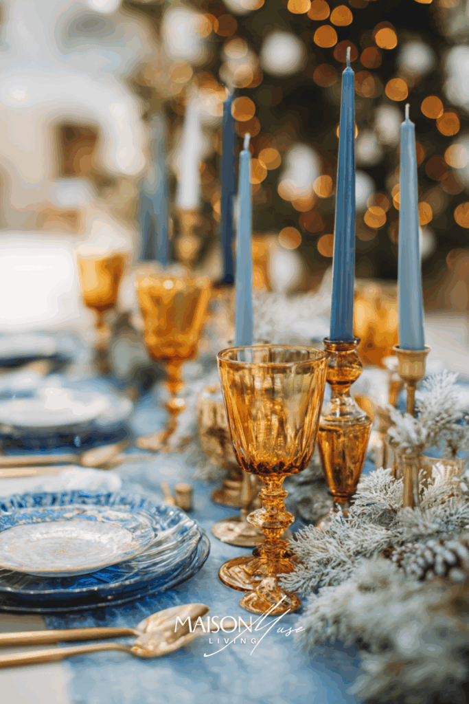
24 | Blue & Honey Gold Warmth
Blue and honey gold – it’s the color equivalent of winter sun through frosted glass. The contrast between the cool serenity of blue and the rich warmth of honey tones creates instant coziness, like a golden glow wrapping your holiday table in light. This palette is timeless, elegant, and so photogenic.

Why it works:
Honey gold adds life to cool winter blues, turning a potentially cold palette into something full of light and comfort. It’s an elevated take on the classic blue-and-gold look: less metallic, more natural glow. The mix of amber glass, golden candlelight, and soft blue textiles creates harmony that feels both seasonal and chic. It’s the kind of table that invites guests to linger, with every reflection and flicker of light adding quiet warmth to the celebration.
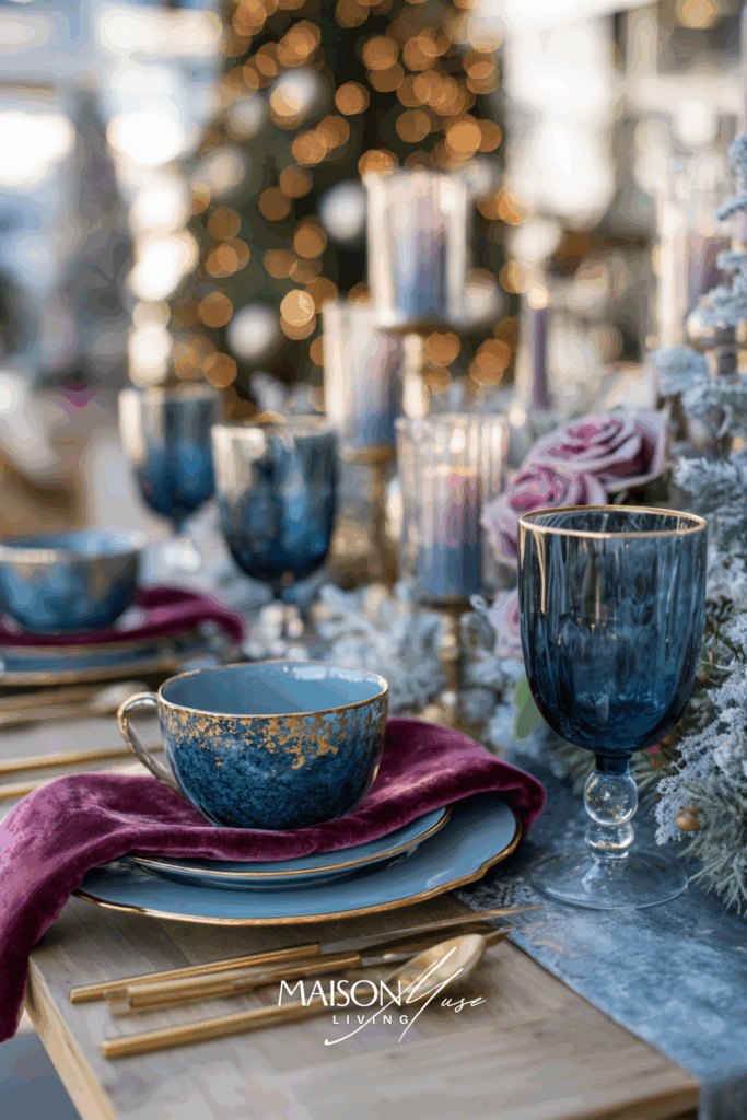
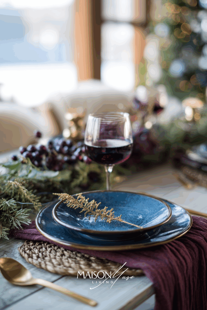
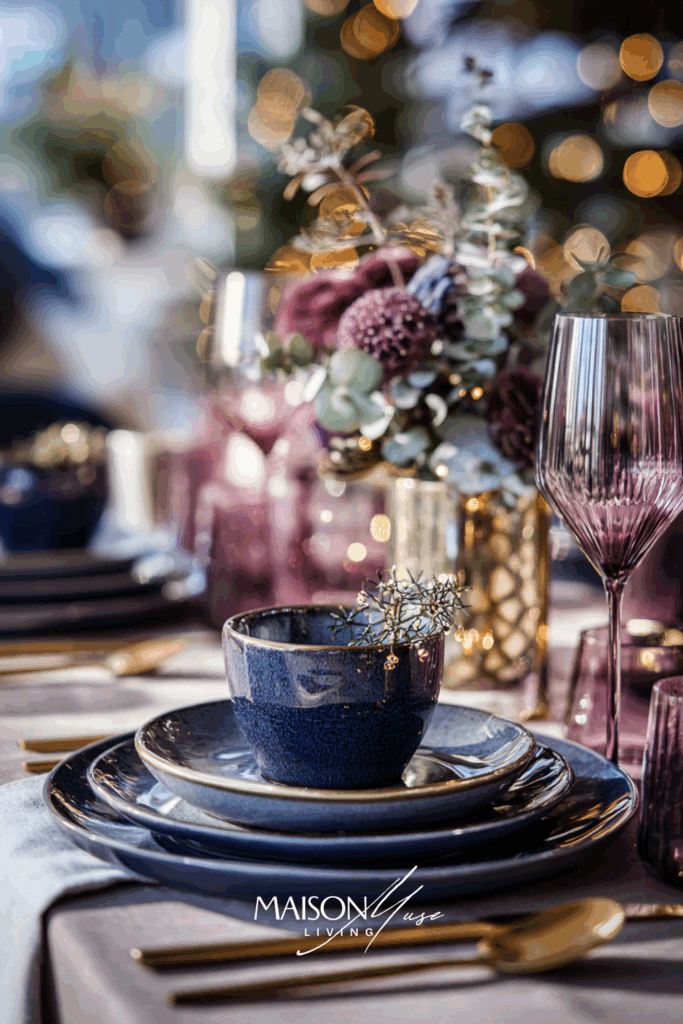
25 | Blue & Mulberry Rose Contrast
This palette brings high-end editorial romance into holiday decor. Deep blue meets soft mulberry rose: a combination that feels elegant, emotional, and a little daring. It’s the perfect look for a Christmas table that’s both cozy and couture, especially under soft winter light.
Why it works:
Blue and mulberry rose create a striking visual tension: cool and warm, masculine and feminine. Together they feel lush and deeply modern. This combination is unexpected for Christmas. Add gold details and candlelight, and the palette becomes cinematic – think “holiday dinner meets Vogue editorial.” It’s polished but approachable, perfect for those who love design-driven decor with a touch of softness.
26 | Blue & Clay Taupe Earth Blend
Grounded, calm, and modern – this palette pairs cool blue with warm clay and taupe undertones for a Christmas look that feels organic and serene. It’s the aesthetic sweet spot between cozy farmhouse and minimalist elegance.
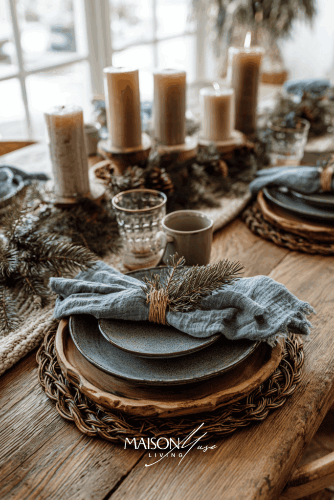

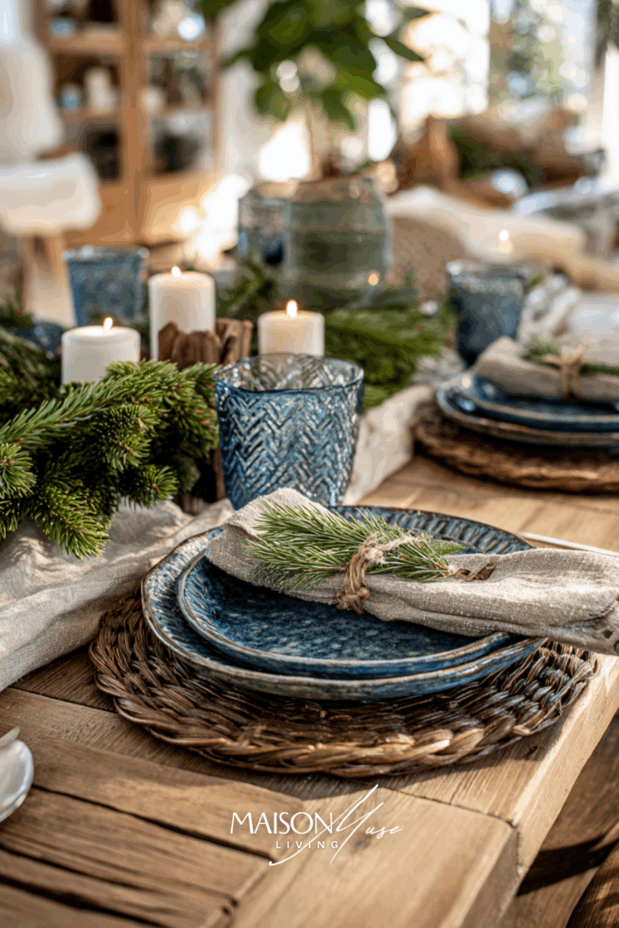
Why it works:
The clay tones bring balance to blue’s coolness, creating warmth without overwhelming the palette. It’s stylish but still deeply comforting – like soft wool against frosted glass.
27 | Blue & Buttercream Elegance
Imagine a Christmas morning scene filled with sunlight, soft fabrics, and golden glow – that’s the energy of blue and buttercream. This palette is light, uplifting, and timeless. It feels like the softer side of holiday luxury, understated but unforgettable.
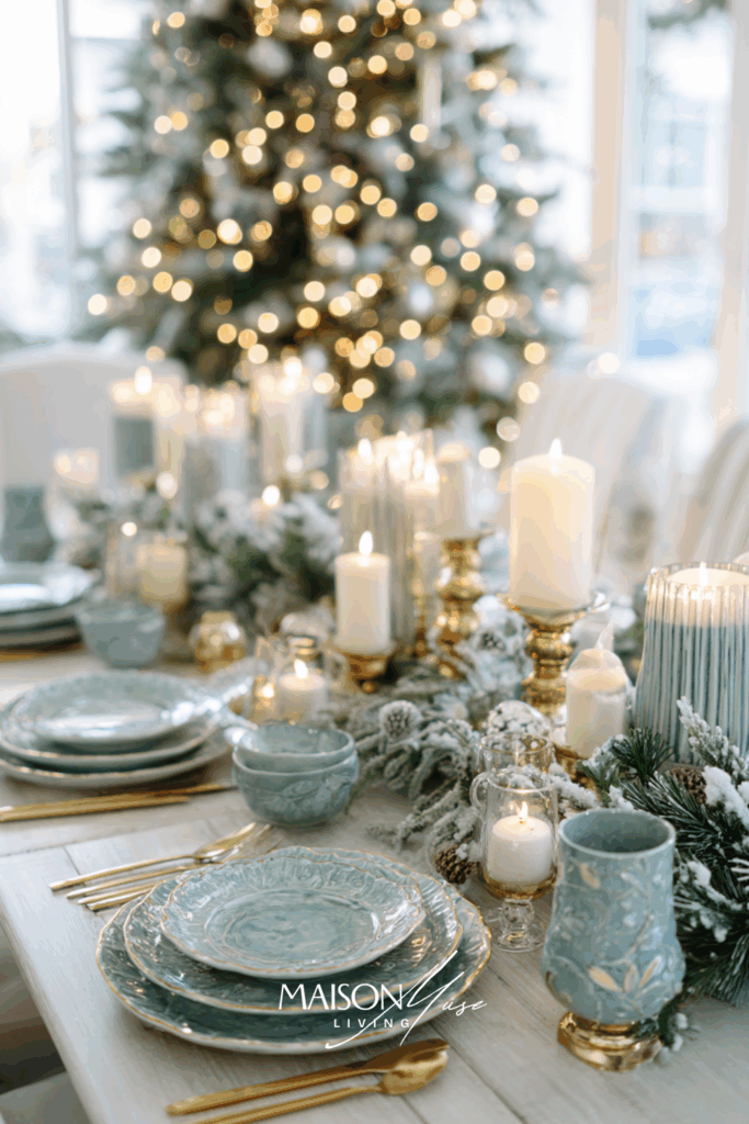
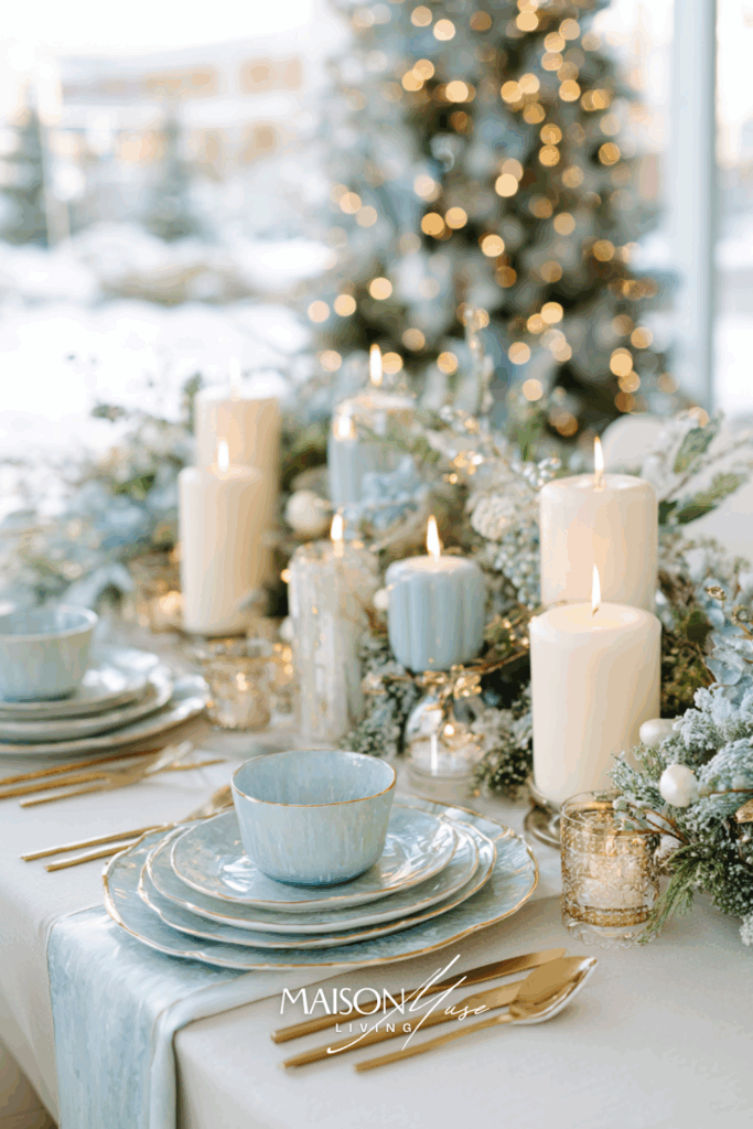
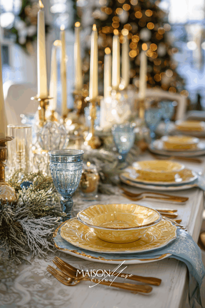
Why it works:
Buttercream adds light, softness, and a touch of joy to blue’s refined calm. The combination feels like a breath of fresh air – perfect for open, bright homes or breakfast gatherings during the holidays.
28 | Blue & Mocha Velvet Luxe
Blue and mocha are an unexpected match made in holiday heaven: cool serenity meets rich warmth. The look feels sophisticated but still welcoming, like a quiet December evening wrapped in candlelight. Think soft mocha napkins, deep blue plates, and the subtle sheen of glass catching the glow of the tree lights behind the table.
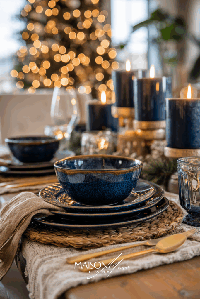


Why it works:
Mocha adds richness and depth to blue without overpowering it. The result feels calm but indulgent: cozy, not cluttered. This palette works beautifully in both modern and traditional homes because it balances cool and warm tones effortlessly. The subtle contrast makes every detail pop, from candle flames to pine sprigs, while still keeping the table grounded and natural.
29 | Blue & Olive Leaf Harmony
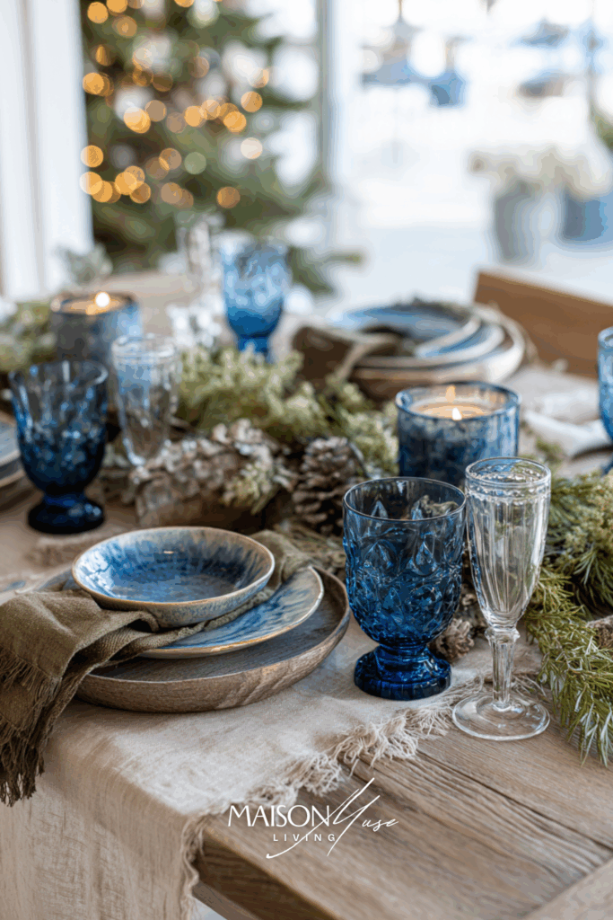
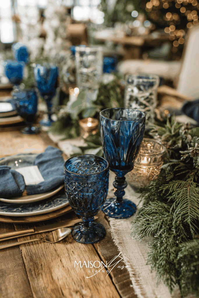
Blue and olive green create a gentle balance between sea and earth: fresh yet comforting. This palette feels timeless, grounded, and naturally festive without relying on red or gold. Imagine soft blue napkins paired with olive-toned candles, a table runner in flax linen, and sprigs of eucalyptus woven through simple white dishes.
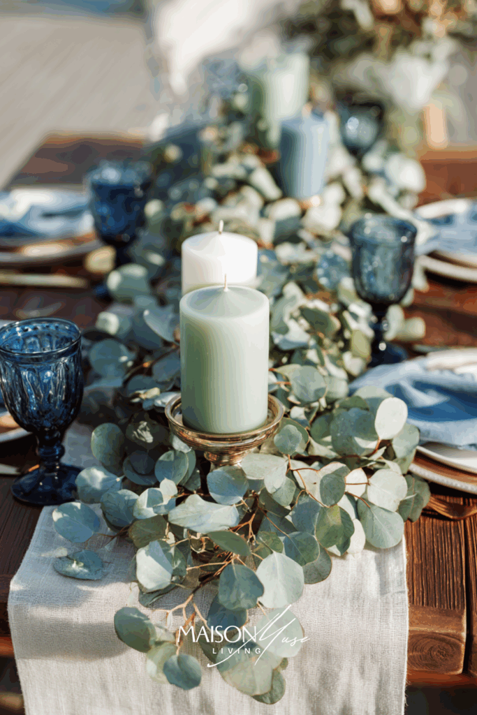
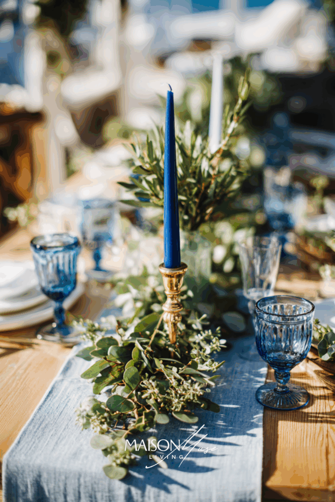
Why it works:
Olive tones soften blue’s cool edge and create a look that feels organic and effortless. It’s elegant without trying too hard. The kind of style that feels curated but still real. This color story mirrors nature: winter sky meets evergreen forest. Add linen textures, glass, and a few candles, and you get a holiday table that feels serene, earthy, and authentically festive.
30 | Blue & White Frost Minimal Elegance
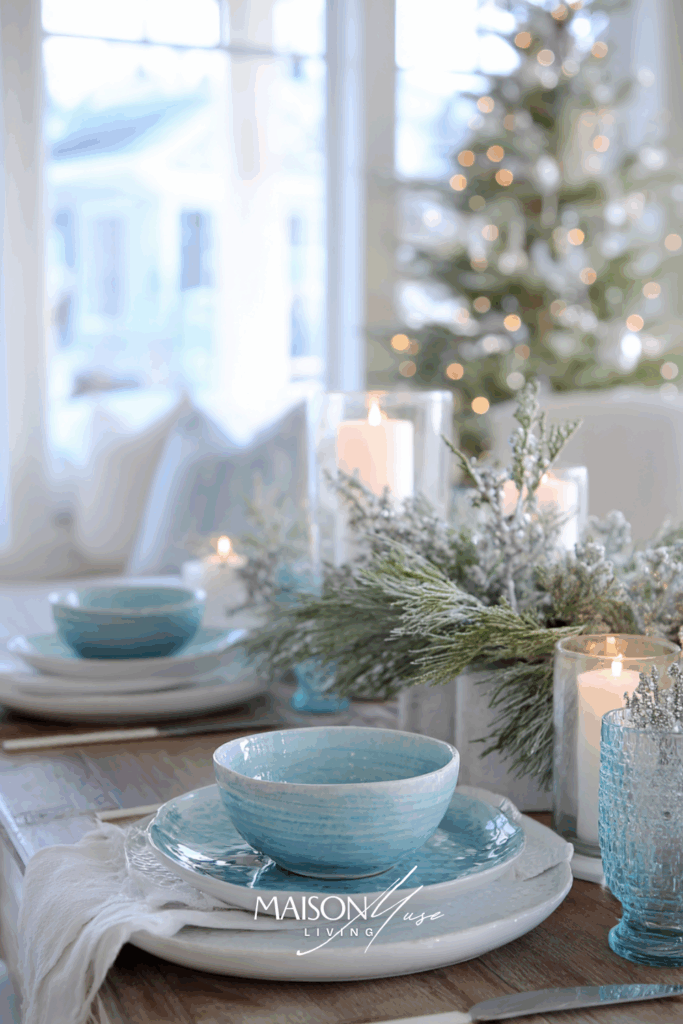
This is the modern take on the classic blue-and-white holiday look – simple, airy, and quietly luxurious. Instead of stark contrasts, the palette plays with layers of soft whites, misty blues, and subtle shimmer. It feels like the morning after fresh snowfall: calm, light, and full of space to breathe.

Why it works:
This palette captures the quiet side of Christmas: soft light, calm colors, and effortless beauty. The key is tone-on-tone layering: combining airy blues with creamy whites and a few translucent accents. It’s timeless, peaceful, and works in almost any space. A few pine sprigs or frosted ornaments are enough to bring in that holiday sparkle without overwhelming the simplicity of the scene.
31 | Blue & Persimmon Ribbon Pop
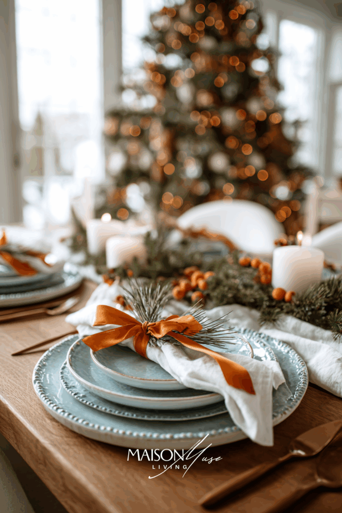
Blue feels extra joyful when it’s paired with small bursts of persimmon ribbon. Tie slim satin bows around napkins, the stems of goblets, and a few ornaments tucked into the centerpiece. Keep the base light – white linen, pale blue plates – then layer those tiny orange-red accents where the eye naturally lands. With a softly glowing tree in the background, the effect is crisp, modern, and unmistakably festive.


Why it works:
The blue foundation stays calm and elegant, while slim persimmon ribbons add energy without overwhelming the scene. Because the warm accent appears in small, repeated touches, it reads intentional and celebratory – perfect for holiday styling that feels fresh and curated.
32 | Blue & Pistachio Winter Garden
Pistachio green brings a gentle, botanical note to blue: think winter garden at first light. Use pale blue napkins with pistachio candles, a simple linen runner, and a garland of eucalyptus with soft seedpods. Add a few blue glass ornaments for sparkle and let the tree glow softly in the distance. The palette feels airy, natural, and quietly joyful.
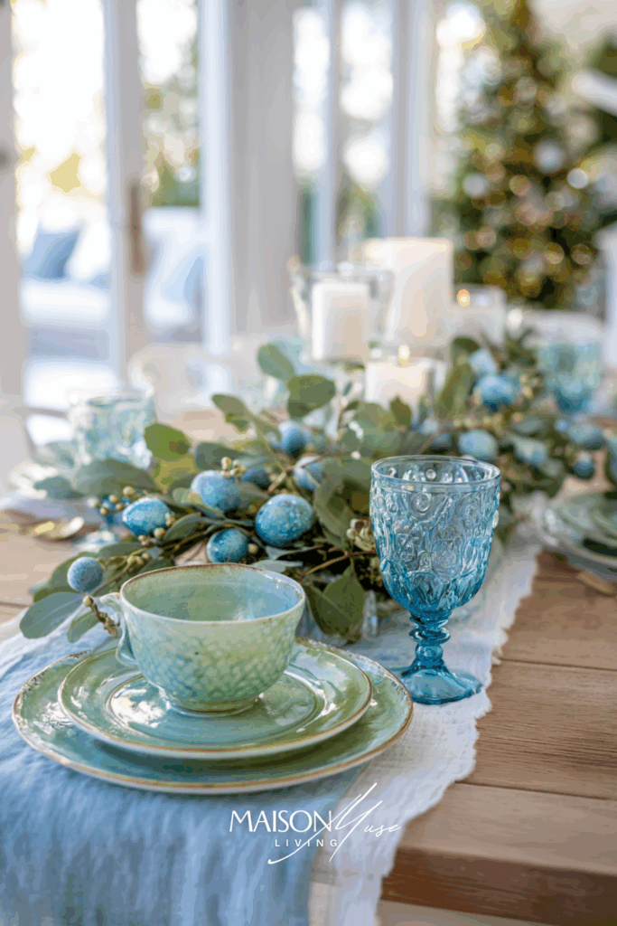
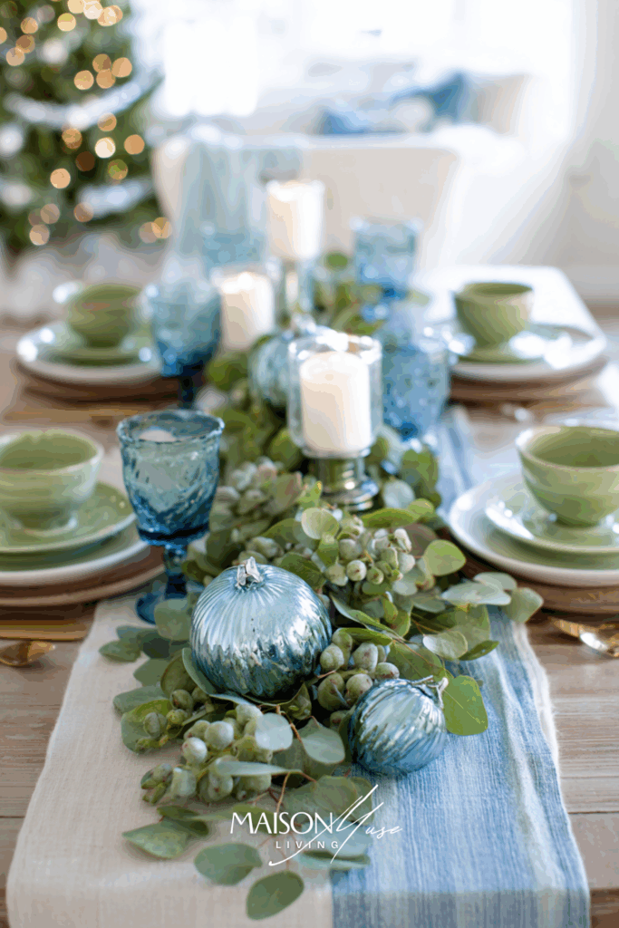
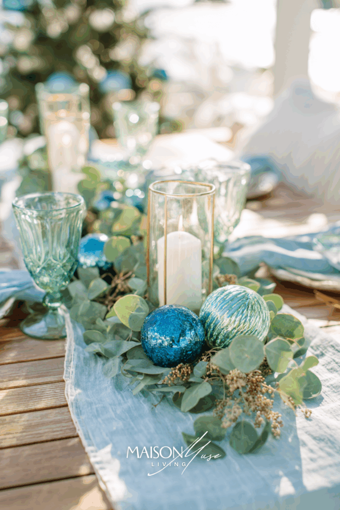
Why it works:
Pistachio softens blue’s cool edge with a botanical freshness that still feels wintry. The combination is soothing and photogenic; greenery bridges the colors so the table looks coherent, not themed.
33 | Blue & Mauve Smoke Evening Glow
For a dinner that feels intimate yet modern, pair deep blue with a whisper of mauve smoke. Swap standard white candles for mauve tapers, add blue glassware, and build a low centerpiece of pine, hellebore, and a few smoky ornaments. Keep the room bright enough to stay airy, but let the candle glow define the mood while the tree lights blur in the background.

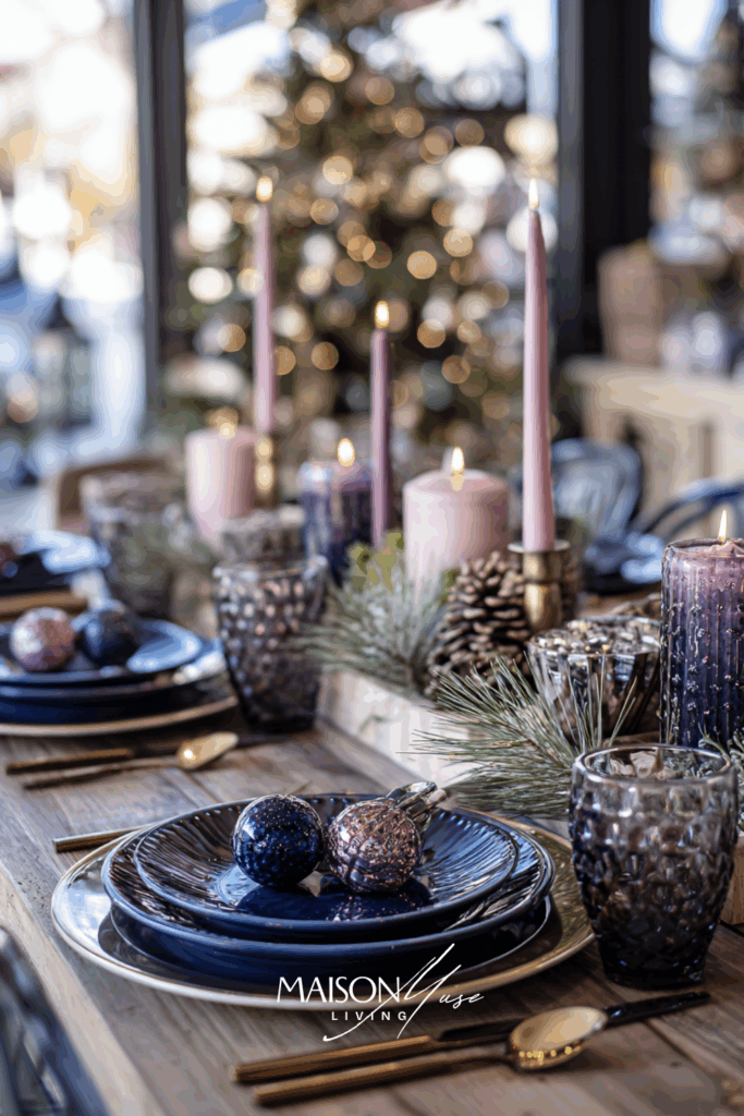
Why it works:
Mauve adds romance and depth to blue without sliding into classic red or pink. The subtle purple-grey undertone feels sophisticated, and candlelight enriches both hues, perfect for a cozy evening celebration.
34 | Blue Monochrome Layers (Shades of Blue)
A single-color story can be incredibly striking when you layer tones and textures. Mix powder, sky, and navy blues with white accents and clear glass. Stack dishes in different shades, alternate napkin tones at each place setting, and run a line of blue ornaments down the center. With a softly lit tree beyond the table, the look is cohesive, calm, and undeniably festive.
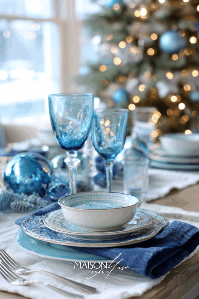

Why it works:
Limiting the palette to blues creates instant harmony; shifting tones and textures keep it dynamic. The eye reads “holiday” thanks to ornaments, candles, and the tree, while the monochrome approach feels designer-level and fresh.
35 | Blue & Clear Acrylic Modern Glow
For a sleek, contemporary twist, set blue against clear acrylic and glass. Use acrylic chargers or napkin rings, blue dinnerware, and a line of translucent candleholders with soft white tapers. Add a few wrapped gifts in blue paper at each place for a playful nod to the season. With fairy lights on the tree softly out of focus, the table feels light, sculptural, and celebratory.
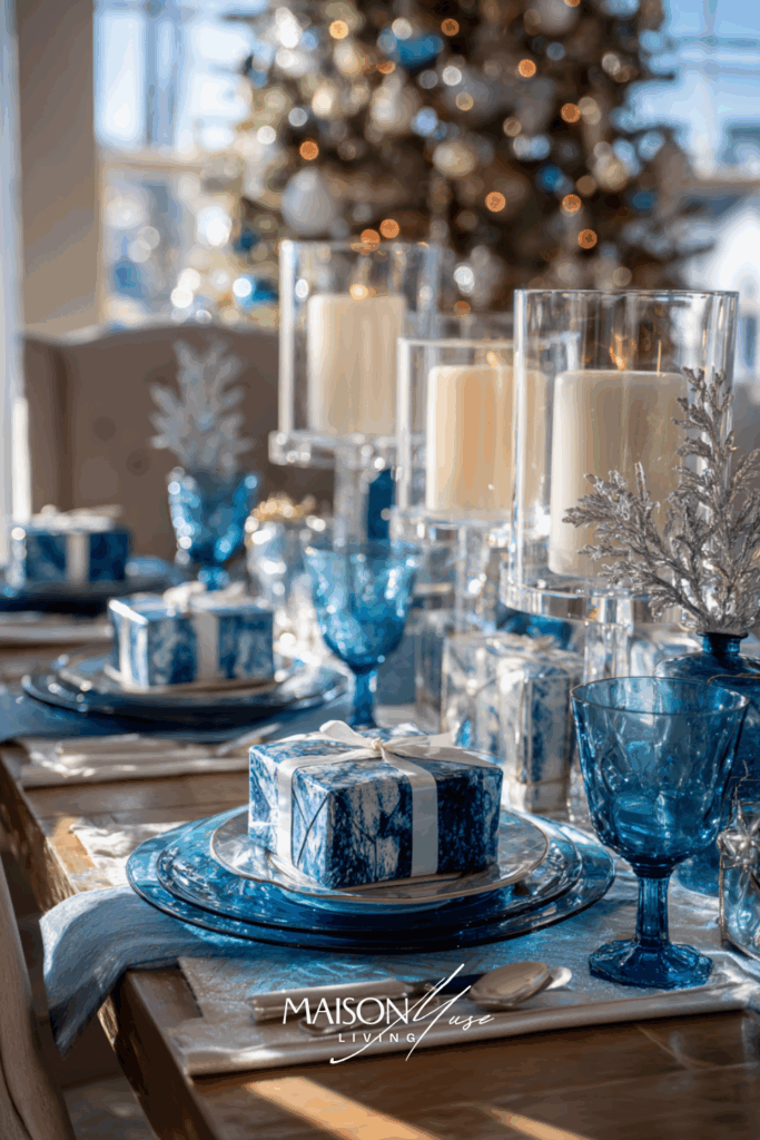

Why it works:
Clear acrylic amplifies light and keeps the setting visually weightless, letting blue stay center stage. The translucent elements add a modern sparkle that reads festive without leaning on classic metallic pairings.
Sizing & Spacing Cheat Sheet
- Place setting width: ~24 in / 60 cm per person
- Charger diameter: 12–13 in / 30–33 cm
- Runner length: table length minus 8–12 in / 20–30 cm per side
- Candle heights: 6–10–12 in (15–25–30 cm) — max three heights mixed
- Centerpiece height: ≤ 12 in / 30 cm or low enough to see over
- Napkins: 18–20 in / 45–50 cm (larger looks better for knots/bows)
- Glassware spacing: ~1 in / 2–3 cm so nothing clinks
- Table for six (quick math): 6–8 tapers + 2 pillars + one low centerpiece
Color Psychology of Blue in Holiday Decor
Blue is one of those colors that never demands attention, it earns it. It carries calm, depth, and quiet confidence, all of which feel surprisingly at home during the holiday season. While traditional Christmas palettes lean heavily into reds, greens, and golds, blue introduces a sense of balance and sophistication. It’s the pause between festive moments, the exhale after a long, joyful day.
In color psychology, blue represents trust, tranquility, and reflection – three feelings that align beautifully with the spirit of the holidays. During a season that’s often busy and bright, blue provides stillness. It allows the eye – and the mind – to rest. That’s why even a single blue candle or napkin can transform the energy of a space.
Blue also connects emotionally to winter itself: snow shadows at dusk, the cool quiet before morning light, the clarity of a crisp December sky. When you bring that tone indoors, your home immediately feels more peaceful and intentional.
Pairing blue with soft neutrals – like cream, linen, or sand – creates elegance that feels both modern and timeless. Add a few natural materials like wood, rattan, or frosted greenery, and you’ll find that blue doesn’t just belong in Christmas decor, it elevates it.
Styling Tips: How to Make Blue Work in Your Christmas Table Decor
1. Start with the Foundation
Choose a soft base – white, linen, or natural wood. Blue looks best when it has room to breathe. Whether it’s a tablecloth, runner, or bare tabletop, the background should let your blues stand out.
2. Mix Shades for Depth
Layer navy, sky, and powder blue for a collected look. Monotone blues feel flat, but varied tones make the setting feel dimensional and curated.
3. Balance Cool with Warm
Blue naturally feels cool, so balance it with warm undertones: amber glassware, beige napkins, or gold cutlery. Even candlelight alone can create the perfect counterpoint.
4. Add Organic Texture
Wood chargers, linen napkins, and frosted greenery make blue feel grounded instead of formal. Christmas tables come alive through texture, not just color.
5. Let Light Be the Accent
Position your setup near natural light or the glow of the tree. Blue thrives in soft brightness, it reflects beautifully and feels serene rather than stark.
6. Introduce Small Seasonal Touches
Keep decor intentional: pine sprigs, ornaments, ribbon. Avoid clutter. Just a few festive details layered into a thoughtful color story look far more elevated than excess decor.
7. Create Flow Across the Room
If your table is blue-themed, echo it with subtle repetition: a blue ornament bowl on the console, a ribbon on the mantle, a blue mug on the coffee tray. Repetition ties the story together visually.
8. Play with Contrast
Pair blue with natural greenery, champagne tones, or even muted peach for a modern twist. The contrast adds warmth and makes your blue accents feel more vibrant.
9. Keep It Seasonal, Not Themed
Focus on feelings – comfort, light, and calm – instead of overt Christmas motifs. The best holiday tables tell a mood, not a message.
10. Finish with Scent and Sound
Blue’s emotional tone pairs beautifully with cozy scents – cedarwood, clove, vanilla – and quiet moments. Set the mood with candles, gentle music, and conversation that lingers long after dessert.
Timeline Checklist (Zero-Stress Hosting)
Common Mistakes & Easy Fixes
- Too many blues → choose one hero blue and one supporting shade at most.
- Mixed metals everywhere → commit to silver or champagne for the full table.
- Centerpiece too tall → go low and wide (compotes/bowls).
- Everything glossy → add matte textures (linen, stoneware, frosted glass).
- Decor on plates blocks serving → keep statements above the plate line.
Final Thoughts
Blue at Christmas isn’t about reinventing tradition – it’s about refining it. It’s calm, sophisticated, and quietly celebratory, bringing a sense of serenity to the season’s chaos.
You don’t need a whole new collection of decor; you just need intention. A few well-chosen blue pieces, some candlelight, and your favorite people gathered around the table, that’s the kind of holiday magic that lasts.
So go ahead: pour a glass, light the candles, and let your table glow in soft winter hues.
Because the most beautiful moments are the ones that feel like home.
You Might Also Like
Looking for more ideas to style, host, and plan a cozy holiday table?
- Christmas Color Palettes
- What’s the Best Dining Table Shape for Your Space?
- Dinner Party Themes You’ll Remember
- Blue Fall Decor Ideas
- Christmas Wreath Color Ideas
FAQs About Blue Christmas Table Decor
Absolutely. Blue has deep winter associations: sky, ice, and calm – and works beautifully with classic neutrals or metallics. It feels sophisticated and fresh.
Navy is timeless and grounding; dusty and sky blues bring softness and light. Mixing a few shades creates depth and visual interest.
Balance it with warmth: candlelight, beige, amber, or gold accents. Texture – like velvet, linen, or wood – also keeps the space cozy.
Yes, but in moderation. Try navy with forest green or muted red rather than bright tones – it feels layered and grown-up.
Use it in accents: napkins, glassware, or ornaments. Blue naturally expands visual space, making rooms feel calm and airy.
Yes! Pick one as the lead (e.g., silver) and keep the other as a tiny accent (≤10%). Blue with champagne feels the softest.
Use blue napkins and one blue glass element (goblets or ornaments). It reads designed without buying a full set.
LED tapers/pillars + crystal or acrylic holders. You keep the look and the peace of mind.



2 Comments