
9 Christmas Color Palettes to Inspire Your Holiday Decor
Disclosure: As an Amazon Associate I earn from qualifying purchases. This post may contain affiliate links, which means I may earn a small commission if you click through and make a purchase – at no extra cost to you.
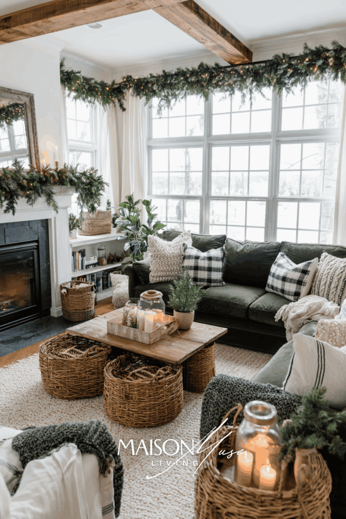
The holiday season has a way of drawing us back to color. Whether you love a classic red and green Christmas or something more unexpected, your palette sets the tone for your entire home. Choosing the right Christmas color scheme not only guides your decorations but also creates a mood that lingers with family and guests. Today I’m sharing nine seasonal palettes that feel timeless yet fresh. Along with inspiration, I’ve included a few favorite products you can add to your own holiday decor.
How to Use These Palettes
Color looks magical in a flat lay, but it has to survive real rooms, real light, and real schedules. The simplest framework I use is 60/30/10: let neutral foundations do 60% of the work (walls, sofa, large rug), give your chosen holiday hue 30% of the space (stockings, ribbon, pillows, a runner), and save 10% for that little sparkle – metal accents, glass, and candlelight. It keeps everything intentional, even when real life gets messy.
Think in textures before things. Every successful palette includes a soft element (velvet, wool), a reflective element (glass, metallic), and something organic (greenery, wood). When those three are present, your colors read deeper and the room feels layered instead of decorated in one afternoon. I also repeat a simple shape: cylinders, spheres, or clean rectangles – so the eye has rhythm to follow.
Do a quick day-to-night test. Style a small surface – console, coffee table, or a short dining runner – then look at it at noon, at dusk, and with candles. Blues intensify after dark; blush tones can lean peach under warm bulbs; green calms down the moment you add real foliage. Make tiny shifts here (swap a metal, add a matte piece, edit one shiny thing) before you scale the palette across the room.
Finally, shop to fill gaps, not to chase an idea. Once your test corner makes you smile, list the exact holes you see – “need soft blue ribbon,” “need one warm metal,” “need frosted glass” – and buy only those. Fewer, better choices beat a cart of maybes every single time.
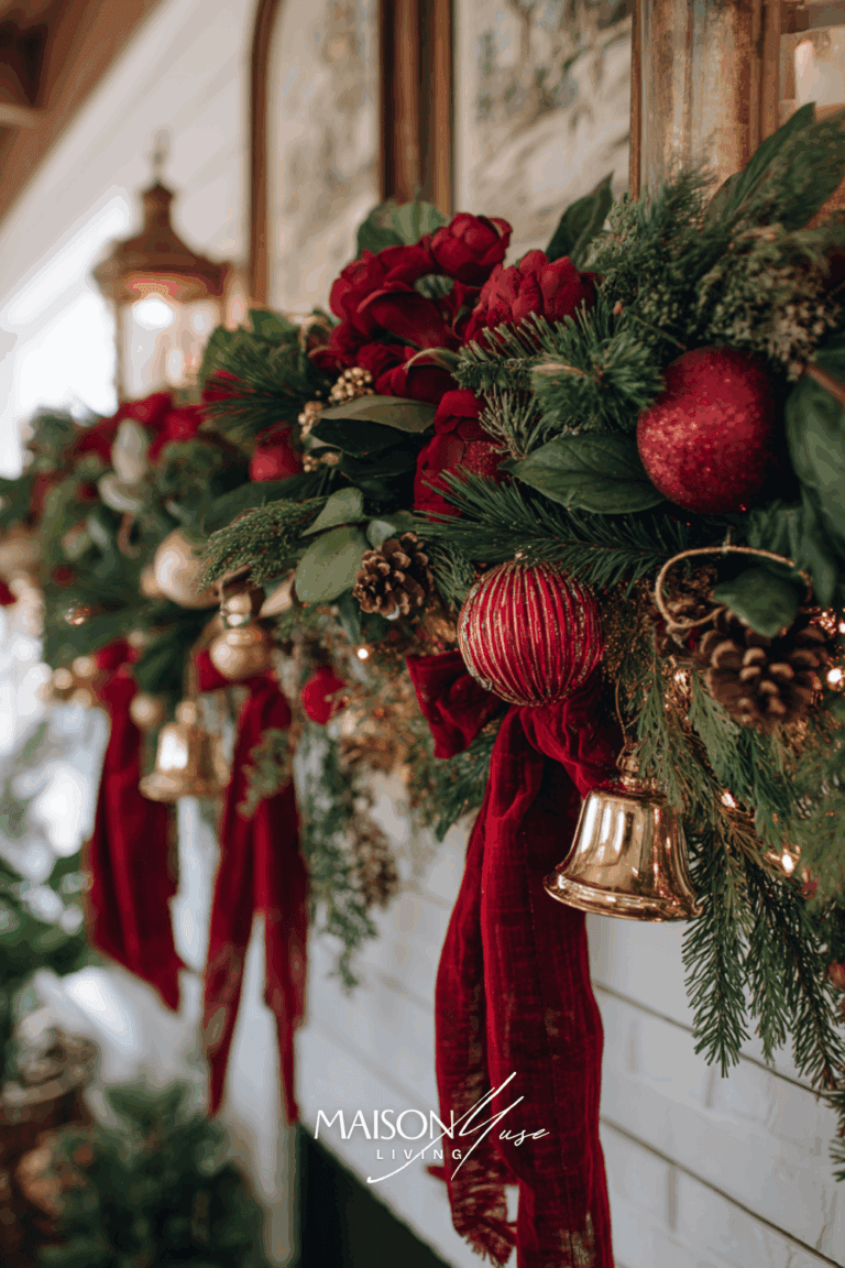
1. Classic Red and Green
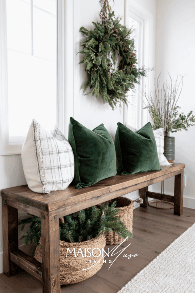
Red and green will always be the heartbeat of Christmas. This palette is full of nostalgia, warmth, and traditions that never fade. Think evergreen garlands, red velvet ribbons, and classic ornaments that have been passed down through generations. Pairing these shades creates an instantly recognizable holiday mood that feels cozy and festive. A few ways to bring this palette to life are with a deep green velvet tree skirt, ruby red glass ornaments, and a plaid throw blanket that ties it all together.
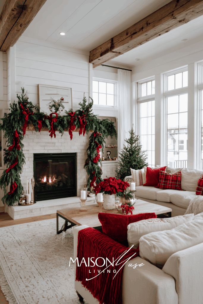

Red + green feels like instant Christmas, but the magic is in the finishes. Keep reds matte (velvet ribbon, wool stockings, stoneware) so they read rich, and choose cream over bright white to stop the palette from shouting. Let greenery do half the work – cedar or eucalyptus looks sophisticated and softens vivid ornaments. Pair with brushed brass or antique gold and repeat that metal in three small places (candle cups, frames, a tray) for cohesion. One plaid piece is plenty; balance it with solids and a little clear glass so the room glows at night instead of feeling heavy.
I limit myself to three red moments in any room – usually a bow, a pillow, and a cluster of ornaments. If the space still says “holiday” when I remove one of them, I know I’ve hit the sweet spot.
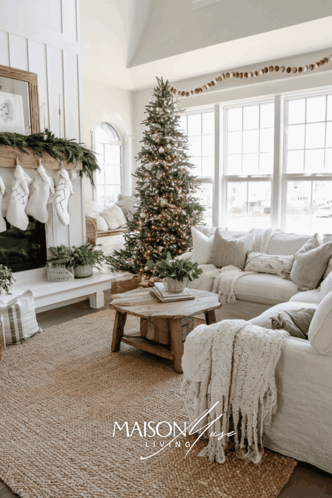
2. Winter Whites and Gold
White and gold create a soft, elegant Christmas scheme that feels like stepping into a snow globe. The crispness of white sets a serene backdrop, while touches of gold add glamour and warmth. This palette is ideal if you want your holiday decor to feel chic but still cozy. To style it, layer white ceramic houses on your mantle, gold candleholders on the dining table, and crisp white knit stockings by the fireplace. Together they create a winter wonderland that glows softly.
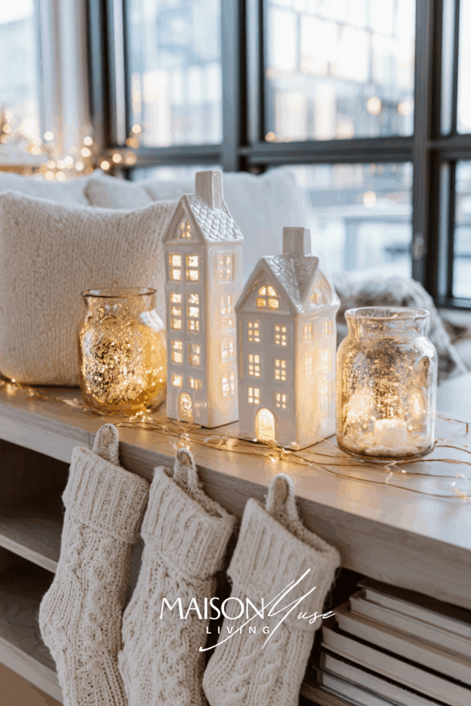
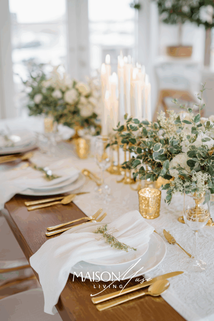
White-on-white looks expensive when it’s about texture, not quantity. Layer a few distinct surfaces: knit, boucle, linen, frosted glass, so the light catches differently across the room. Choose ivory or warm white for textiles (bright, cool whites can feel clinical at night), then let champagne/brushed gold be the quiet sparkle that repeats in three small places. Keep your bulbs at 2700K and cluster candles: the warmer light softens edges and turns the whole palette into a glow. Add just a breath of greenery (eucalyptus or cedar tips) so the whites don’t read flat – think 70% white, 20% greenery, 10% gold and you’re in snow-globe territory.
3. Forest Green and Natural Wood
This palette celebrates nature at its finest. Deep forest green combined with natural wood tones creates a calming, organic holiday atmosphere. It’s perfect for homes that lean rustic or Scandinavian in style. Bring this look to life with woven wicker baskets filled with greenery, forest green ceramic mugs for cozy nights, and a wooden serving tray styled with pinecones and candles. It feels grounded, authentic, and timeless.
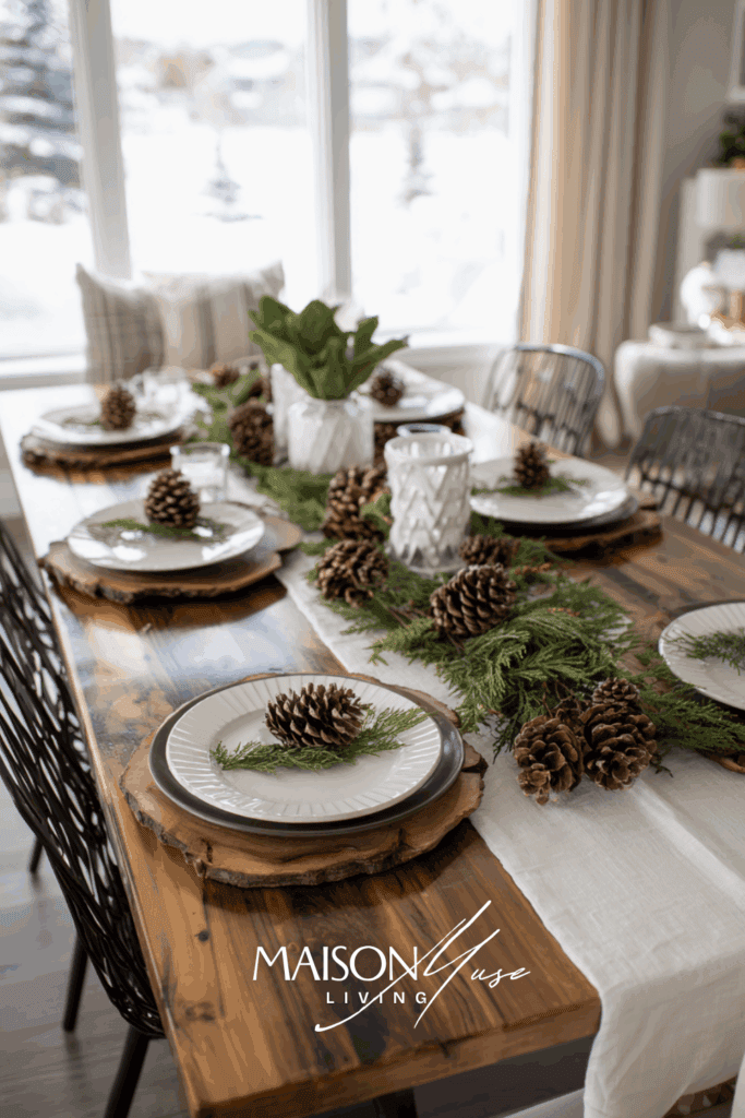
This palette feels grounded because everything in it has a little matte to it: cedar, pine, rattan, wool, raw wood. Let ivory or flax carry the larger textiles, then bring in forest green through pillows, ribbons, and one or two dense greenery moments. Pair it with antique brass or black (not shiny gold) so the undertones stay mellow, and repeat that finish in three small places – candle cups, a frame, a tray – so it reads intentional. Mix wood tones, but keep them all on the warm, desaturated side; if something skews orange, knock it back with linen and black accents. Tables style themselves with this palette: a low bed of cedar, a few cones, clear glass for glow – done!
My favorite “free” styling trick is to ask the tree lot for trimmed branches; they’re perfect for garlands and bowl fillers, and they make the house smell like a forest without buying a single extra thing.
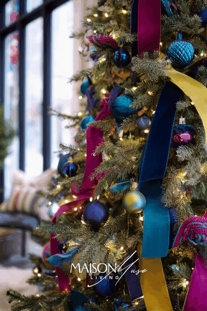
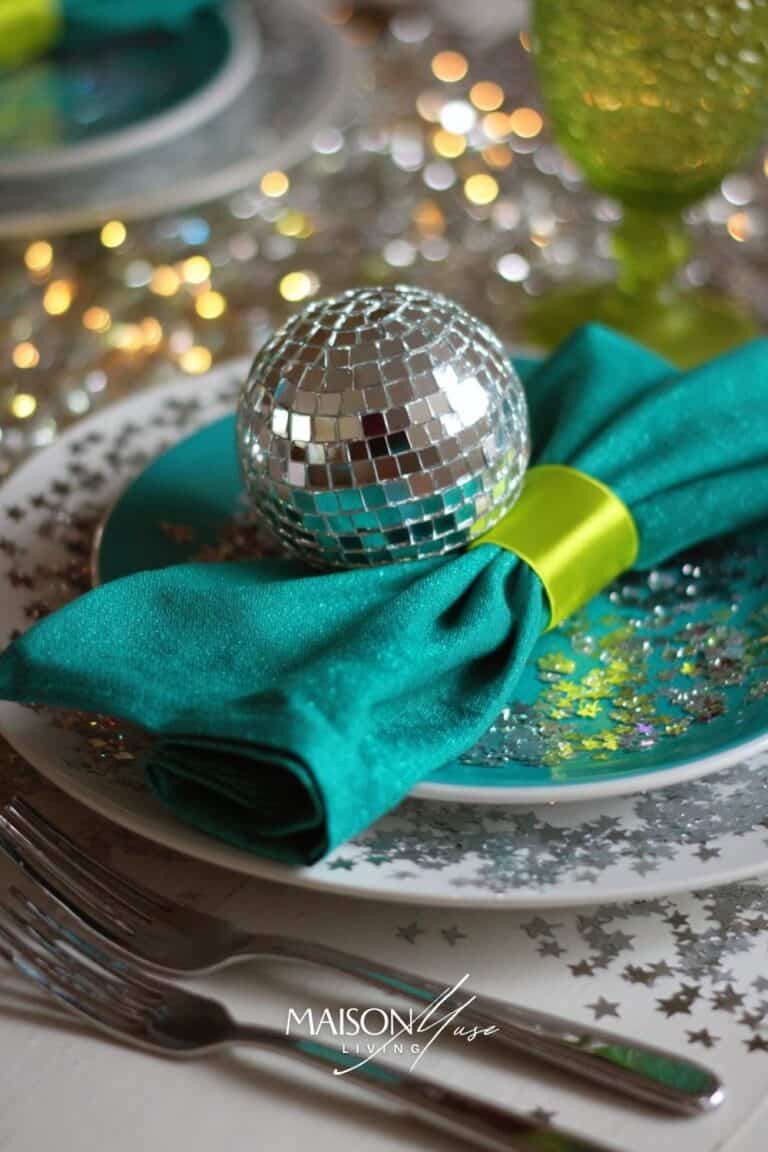
4. Navy and Silver
Navy and silver is a sophisticated Christmas palette that feels modern yet timeless. The deep blue adds richness and calm, while silver sparkles with a frosty elegance. This scheme works beautifully in both small accents and full-room styling. Style it with silver baubles, navy velvet stockings, and a mercury glass vase filled with winter greenery. The result is sleek and chic but still welcoming.
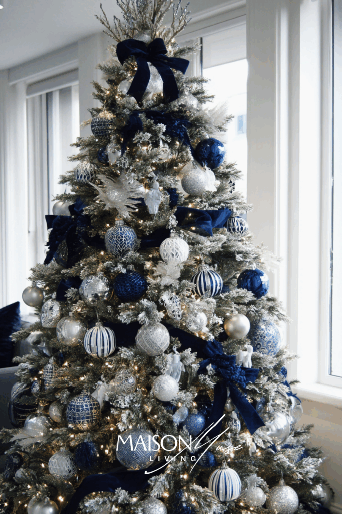
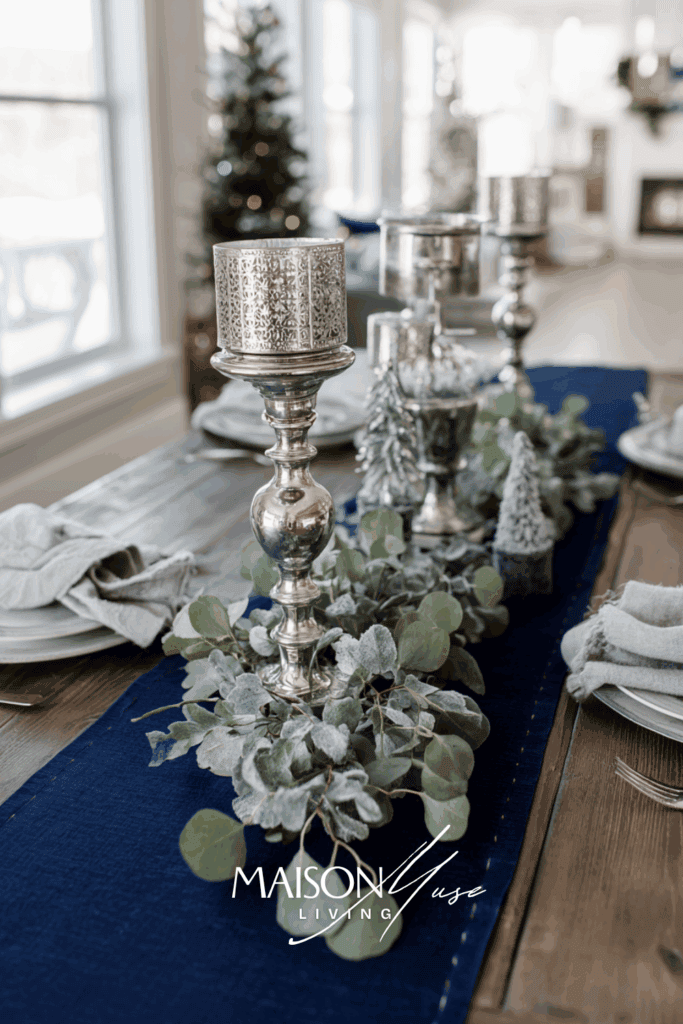

Navy + silver looks luxe because it’s all about clarity and glow. Keep whites clean (optic or cool white) so the navy stays crisp, and stick to one metal family – silver/nickel/chrome – so the reflections match. Balance the cool tones with texture: velvet ribbons or stockings for depth, plus boucle or wool on the sofa so the room doesn’t feel slick. Let crystal and frosted glass bounce candlelight. Mercury glass is great here because it sparkles without glare. Choose greenery with cooler undertones (eucalyptus, cedar tips) and avoid very yellow-green pine. If you want a lighter note, add a whisper of powder or slate blue at ≤20% so navy remains the hero. And if the space tips too cold after dark, introduce one natural wood moment (a tray or side table) or a linen runner, just enough warmth to make the whole palette feel inviting.
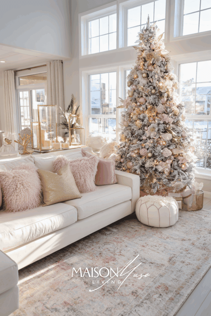
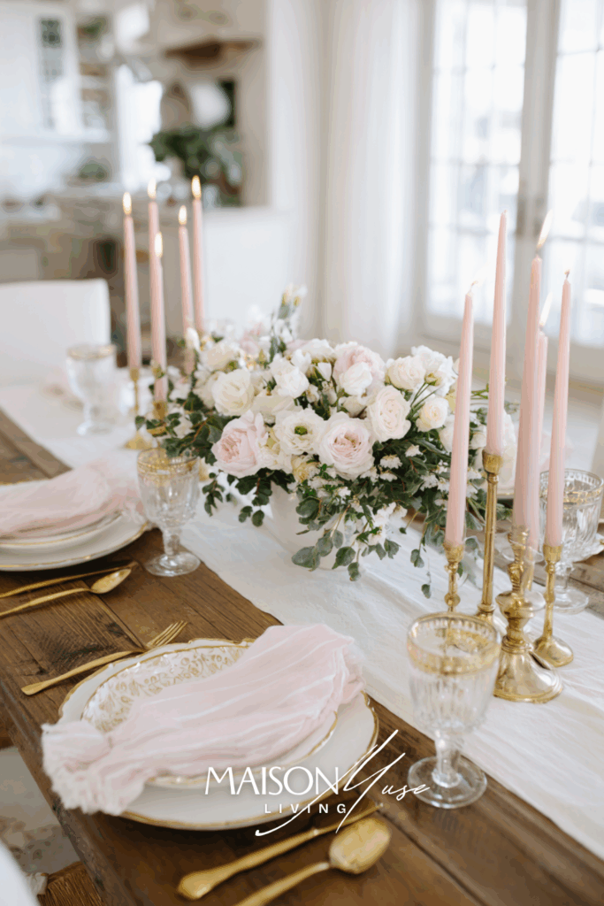
5. Blush and Champagne
Blush and champagne bring a soft, romantic touch to holiday decorating. It’s perfect for those who want something feminine and unexpected but still festive. These tones shine against white backdrops and twinkle beautifully under candlelight. Style the palette with blush velvet ornaments, champagne-colored faux fur pillows, and soft blush taper candles. The effect is dreamy, delicate, and cozy all at once.
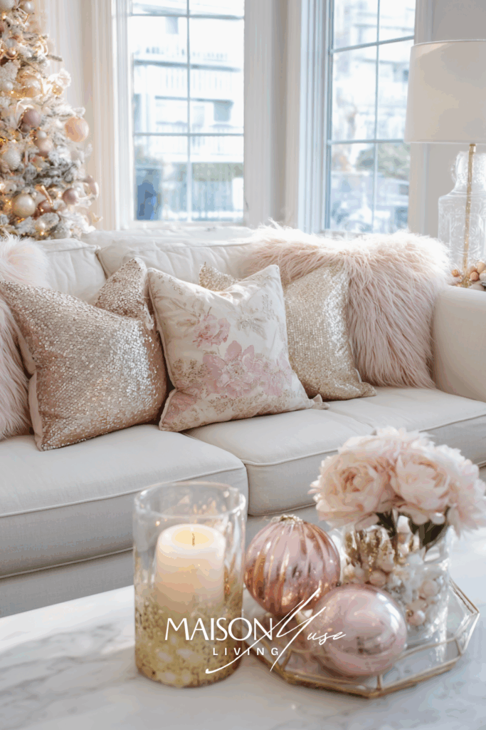
Blush works when it’s dusty and desaturated, not bubble-gum. Look for shades with a hint of beige or mauve, and keep the backdrop ivory/oyster instead of bright white so everything melts together in a soft way. Pair with champagne or brushed gold – never super yellow gold – and repeat that metal in three quiet touches (candle cups, frames, a tray) so the sparkle feels intentional rather than loud. For greenery, choose eucalyptus or olive over neon pine; cooler foliage keeps the palette elegant.
Texture does the heavy lifting here: mix boucle or faux fur with linen and silk-velvet ribbon for depth, then add clear or frosted glass to bounce candlelight. If the room starts to feel too sweet, introduce one tiny line of contrast: smoke glass, alabaster stoneware, or a thin black frame, and it instantly reads grown-up. At the table, keep arrangements low, use blush tapers in staggered heights, and let the flowers echo your blush in only a few spots; restraint is what makes the whole scene look dreamy and expensive.
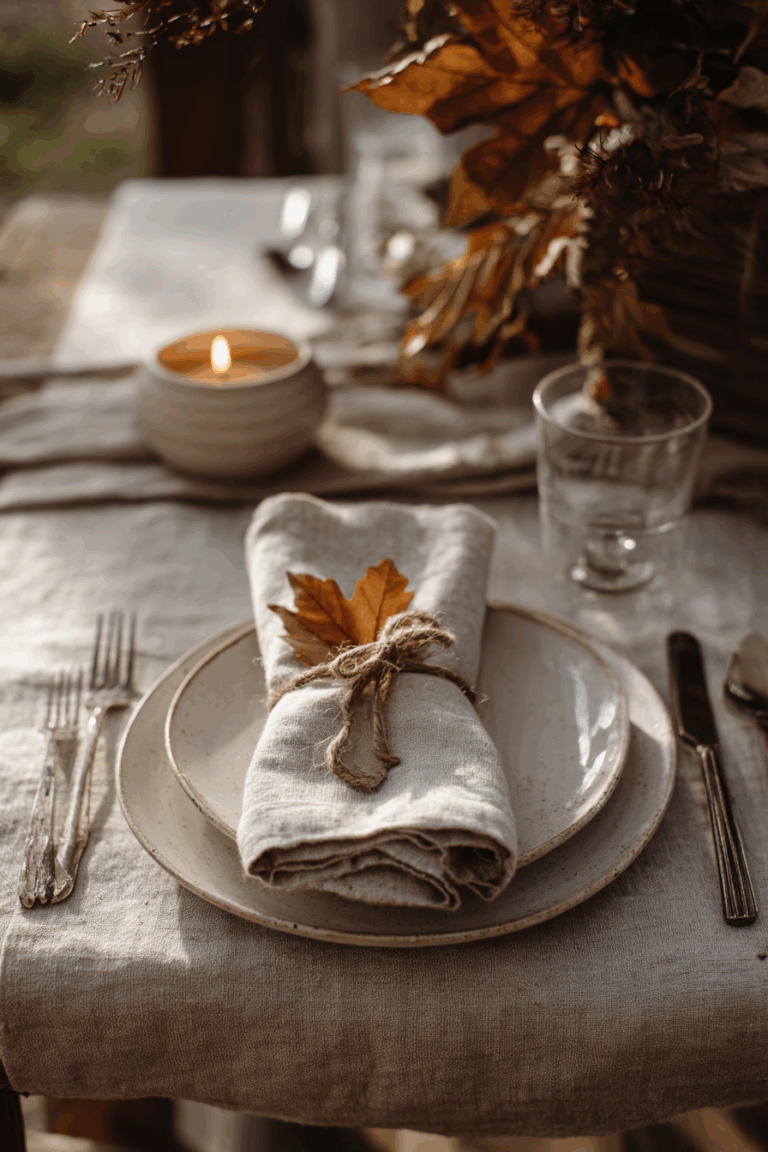
6. Rustic Neutrals
If you love a quiet and earthy holiday atmosphere, rustic neutrals are a beautiful choice. Think sandy beige, warm browns, and ivory tones layered with natural greenery. This palette creates a cozy cabin-like charm without feeling cluttered. Style the look with jute tree skirts, linen stockings, and wooden bead garlands draped across the tree or mantle. The warmth of these tones feels grounding, calm, and perfect for slow festive mornings.

Rustic neutrals feel calm because nothing is shouting. Everything is a little matte, nubby, and warm. Keep your base to creamy whites, oatmeal, and sandy beige, then layer linen, jute, boucle, and raw wood so the light breaks softly across the room. If your wood reads a bit orange, balance it with stoneware and flax and bring in one or two black/iron details (a frame or lantern) for definition. Metals should be quiet – antique brass or pewter over mirror-gold – and greenery works best when it’s loose and natural: cedar, olive, or eucalyptus rather than neon pine. Unscented beeswax tapers are the secret here; their warm tone matches the palette and makes every neutral look intentional.
On slow December mornings I light two beeswax candles and leave the room otherwise untouched. No centerpiece, no extras. If the space still feels cozy and finished, I know the textures are doing their job.
7. Black and White
Black and white might not be a traditional holiday scheme, but it is strikingly modern and chic. The high contrast feels bold yet simple, especially when paired with glowing fairy lights. You can soften the look with cozy textures so it does not feel too stark. Try black and white striped ribbons, matte black candleholders, and fluffy white faux fur throws. The result is dramatic and modern.

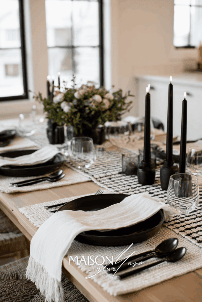
High-contrast looks chic when it’s edited and tactile. Let ivory (not icy white) carry the large surfaces so black reads graphic instead of harsh, then add texture – boucle throws, linen napkins, matte ceramics – to soften the edges. Keep metals disciplined: choose one (black iron or antique silver both work) and repeat it in small doses so the reflections don’t fight the palette. Black loves smoke glass and unscented tapers; the glow keeps the scheme from feeling stark at night. Limit patterns to a single hero (a stripe or micro-check) and echo black as thin lines – ribbons, candleholders, picture frames – rather than big blocks.
I aim for 70% ivory, 20–25% black, 5–10% greenery. If the room still feels moody after dark, I add one warm element: wood tray, beeswax candles, or a flax runner, and the whole space relaxes without losing that modern edge.
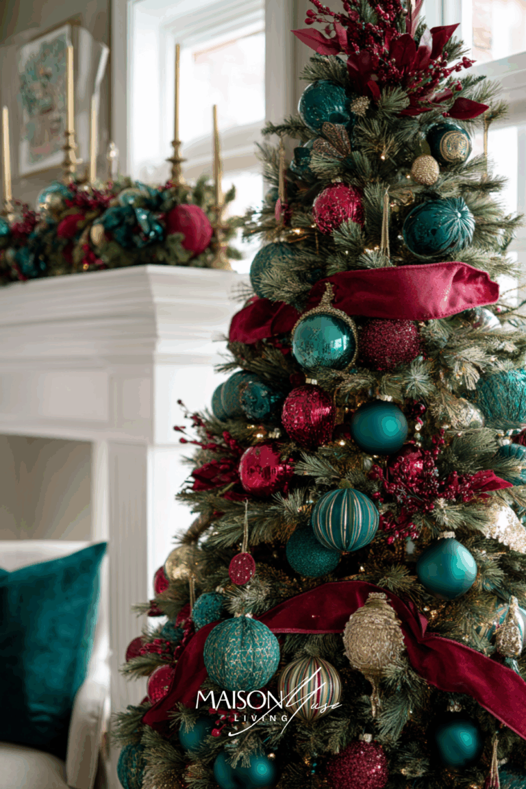
8. Jewel Tones
For a more dramatic take on holiday colors, jewel tones create a rich, luxurious atmosphere. Think emerald green, ruby red, sapphire blue, and deep amethyst. These shades work beautifully together and make your home sparkle with personality. Try jewel-toned glass ornaments, velvet throw pillows, and bold taper candles for a lavish finish. This palette feels festive but in an elevated, elegant way.
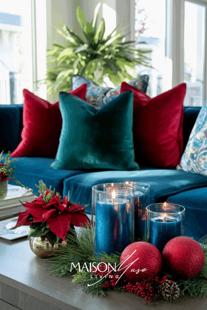
Jewel tones are saturated and glamorous, so give them a calm stage: ivory, greige, or walnut wood as the base, then let two hero colors do the talking with one supporting accent. Velvet is your best friend here: its surface drinks light in a way that keeps ruby, emerald, and sapphire rich instead of loud. Pair with brushed gold and lots of clear/faceted glass so candlelight throws little sparkles rather than glare. On the tree, run wide velvet ribbon in long vertical swaths and cluster ornaments by color to create intentional pockets. Balance finishes at about 70% matte / 30% glossy-metallic, and sprinkle a few smoke or crystal pieces to break up the density. Warm bulbs (~2700K) deepen the tones beautifully at night.
I always pick two jewels (usually emerald + sapphire) and make them appear three times each: a ribbon, a pillow, a cluster on the tree. If I’m tempted to add a fourth hue, I add texture instead; it keeps the look luxe instead of carnival.
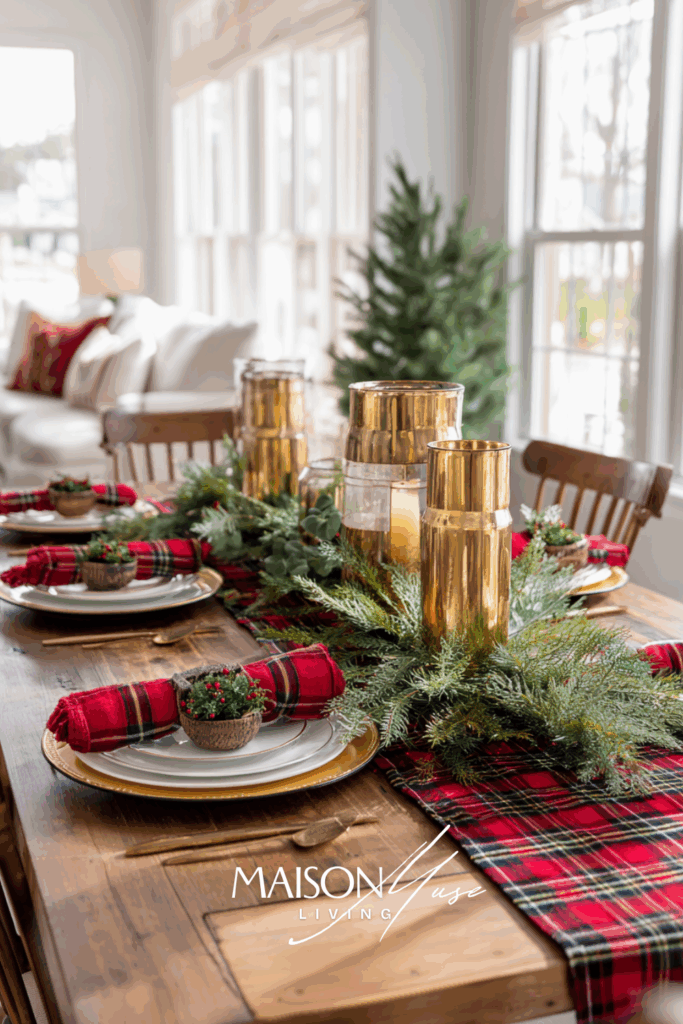
9. Candy Cane Red and White
For those who love a playful holiday vibe, candy cane red and white is a joyful palette. It feels cheerful and nostalgic, reminding us of sweets, childhood, and the magic of the season. This scheme is perfect if you want a fun family-friendly holiday look. Style it with peppermint-striped ornaments, red and white knit stockings, and candy cane garlands draped across doorways. It is whimsical yet still timeless.
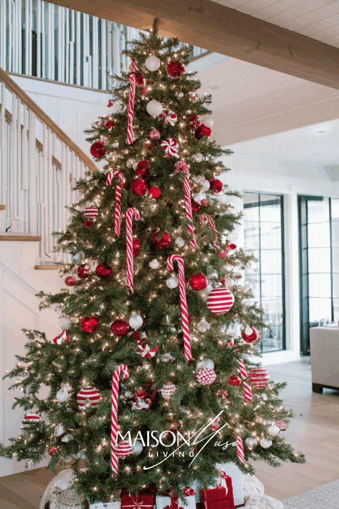

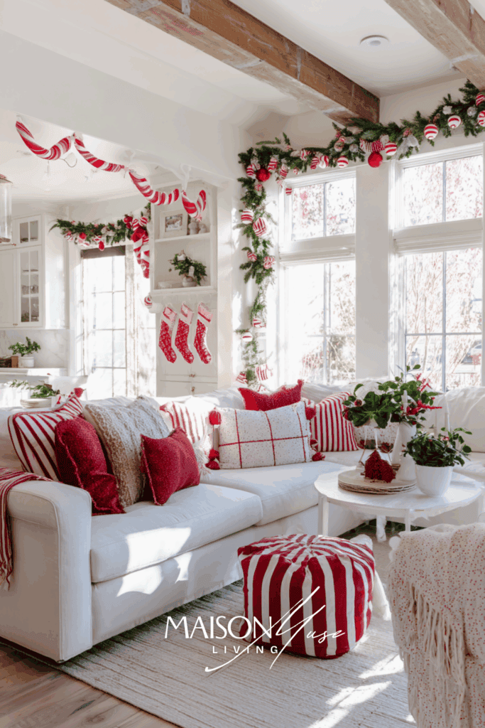
Candy-cane red and white is pure joy, but it looks best when one striped piece is the star and everything else supports it. Keep the stripes to a single scale (wide or narrow) so the room doesn’t start buzzing, then echo the motif in two small places – ribbon tails and a stocking cuff are plenty. Let the rest of the red show up as matte solids (velvet pillows, wool throws) and soften the scene with ivory textiles so the crisp candy-cane white doesn’t feel harsh. Greenery is your best anchor: a loose cedar garland and a bowl of cloves or cranberries instantly ground the sweetness. Clear glass and natural wood keep it feeling fresh instead of theme-y, and a few brushed-brass touches warm the palette at night. If it tips “too peppermint,” remove one striped item and add a plain linen runner, the whole room calms without losing the fun.
Undertone & Lighting, Explained
Undertones are the quiet part of color that make or break a palette. Place your swatches or key items on plain white paper: if the paper looks yellow, your color skews warm; if it looks pink/blue, it’s cool. That quick read tells you which neutrals and metals will behave. Then check your palette in daylight, warm bulbs, and candlelight. Blues get moodier after sunset; champagne metal smooths harsh contrasts; frosted glass gives you glow without glare. If something feels “off,” it’s usually not the color – it’s the light + finish combo around it. Color behaves differently across the day, so give your palette a quick audit before you commit.
Metals & Materials that Actually Match
Metals are like punctuation. They don’t carry the sentence, but they decide how it reads. Crisp pairings – blue with silver, red with brushed brass, green with antique brass or black – work because they respect undertone. After you choose a lead metal, repeat it in three small spots (frames, candle cups, a tray) so it looks deliberate. Then layer materials: linen for breathability, wool or boucle for softness, stoneware or matte ceramics for calm, and clear or frosted glass for sparkle. When in doubt, remove one shiny thing and add one matte thing. The palette will breathe!
Scale & Pattern (why your room looked “busy”)
If your room feels loud, it’s usually a scale problem, not a color problem. Use one large-scale element (tree skirt, tablecloth, or a hero pillow), one medium (a plaid runner, striped ribbon), and one small (tiny motif ornaments) – then ground them with a solid throw or candle cluster. Keep at least two of those pieces in your base neutral so the color story can sing. If it still jitters, swap the small pattern for a solid and repeat a simple shape (cylinders or spheres) to settle the eye.
Where to Start (entry, living, dining)
Entry: pick one palette piece (a ribbon color or a wreath accent) and echo it twice: on the console and on the doorknob. Visitors get the story in five seconds.
Living room: style the coffee table first. Group a candle trio, one textural object (stone, wood), and a small floral or greenery moment that matches your palette. If this looks good, your shelves and sofa are easy.
Dining: keep sightlines clear. Low arrangements, matched metals, and one consistent glass story (all clear, or all frosted). Palettes look more expensive when the center of the table isn’t competing with dinner.
A 15-Minute Test that Saves You Money
Set a timer. Pull 5–7 things you already own that belong to your palette: books, ribbons, bowls, textiles. Style one surface and walk away. Come back at night, light two candles, and take a photo. If the photo makes you want to keep scrolling, the palette is right. If you start nitpicking, change one variable at a time: the metal (brass ↔︎ silver), the finish (shiny ↔︎ matte), or the amount of your accent color. Tiny edits > buying more stuff.
Common Mistakes & Easy Fixes
The biggest mistake is too many colors. Cap it at two colors + one metal; if a third sneaks in, keep it subtle (5–10%) and repeat it three times so it reads intentional. The second mistake is all shine: it looks flat in photos and harsh at night. Swap one shiny piece for linen, wool, or matte ceramic and watch the room relax. The third is mixed metals everywhere. Choose a lead finish for this season and let everything else act like background singers. Still not right? Don’t add color, increase light/dark contrast within the palette, or bring in a small black accent for definition.
Final Thoughts
Any palette can feel elevated when you design the glow as much as the color. Work in 60/30/10, keep one lead metal you repeat on purpose, and layer soft + reflective + organic textures so everything looks richer at night. Test your palette on a single surface, photograph it in daylight and candlelight, then shop only for the gaps you notice: fewer, better choices always win.
Choosing Christmas colors isn’t about rules; it’s about the feeling you want your home to hold. When you plan with heart, people sense it in the textures, the candlelight, and the quiet little moments you repeat. I hope these palettes help you tell a story that feels like you and that the memories outshine the ornaments long after the tree comes down.
You Might Also Like
- Blue Christmas Table Setting Ideas
- What’s the Best Dining Table Shape for Your Space?
- Dinner Party Themes You’ll Remember
- Blue Fall Decor Ideas
- Christmwas Wreath Color Ideas
FAQs about Christmas Color Palettes
The most traditional Christmas palettes are red and green or gold and white. These combinations have been around for generations and never lose their charm. You can modernize them with updated textures and accents, but the base colors always feel timeless.
Start by considering your existing decor and the atmosphere you want to create. If your style leans minimalist, neutrals or black and white may feel most natural. If you prefer cozy tradition, red and green or jewel tones bring that warmth and nostalgia.
Yes, but do so thoughtfully. You can create cohesion by sticking to one palette per room or by carrying one accent color throughout the house. This way, your home feels intentional while still allowing for variety in different spaces.
Focus on stockings, ornaments, ribbons, and table accents. These small touches carry a lot of visual weight and make your palette clear. A few well-chosen items can shift the entire mood of your holiday decor without needing a full overhaul.


3 Comments